We’re continuing our series on the architecture of Hollywood Boulevard at Disney Hollywood Studios. Part One covered Hollywood Junction, and we’re heading up the street (northeast, technically). We’ll eventually make our way up to the Main Entrance and back down the southern side of the street. But, we’ll intersperse some posts about trip planning and other things that tickle my fancy. (I don’t usually talk like my grandmother, but occasionally – apparently – I do.) Next up is Trolley Car Cafe (a.k.a. Starbucks).
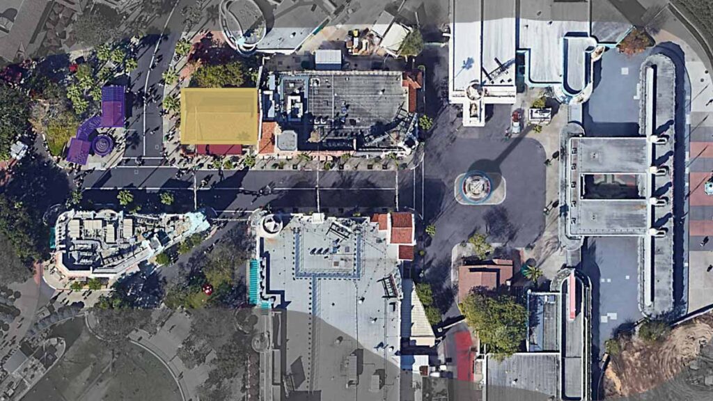
Across the street from Hollywood Junction (shown in purple above), is the Trolley Car Cafe (highlighted in gold). You probably know it as “the Starbucks at Hollywood Studios”. Some of you find it incredibly convenient, and some of you find it incredibly annoying, that Disney has allowed / invited Starbucks into the parks. But, in my humble opinion – an opinion concerned mostly with “theme” and architecture – the repurposing of this building as a coffee shop-in-an-old-trolley-station has brought some much-needed activity and cohesiveness to this corner of the Park.
Before Trolley Car Cafe came to be, the building was home to L.A. Cinema Storage, one of the generic retail stores at the Studios. But, the building was simply themed as a storage building filled with props. And given the exterior is themed as a trolley station, it just seemed like a thematic miss. Yes, the Park was initially conceived as a movie backlot, but Hollywood Boulevard was really not part of that theme. It was always more of an “establishing shot” to root you in Old Hollywood.
Connection to Hollywood Junction
As it relates to the subject of our previous post – Hollywood Junction – it makes sense that this is the next building we focus on. I won’t go into all of the backstory detail here – you can check out that Hollywood Junction post for that. But, the short version is that the Trolley Car Cafe is the main substation (and perhaps storage barn) for the Pacific Electric Railway. Also known as “Red Cars”, the Pacific Electric Railway was an actual mass transit trolley company, based in Southern California in the early 20th century. Hollywood Junction, across the street, serves as a ticket depot and shelter for the Red Cars. And the Trolley Car Cafe ties strongly to it – both in proximity and architectural style. Both buildings are in the Mission Revival Style – quite popular in the era of Old Hollywood.
Drawing upon the design of the Spanish missions in California from a hundred years before, unadorned stucco walls and low-pitched, clay tile roofs with projecting eaves typify the style.
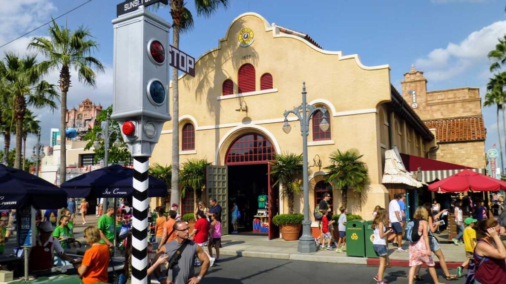
In many buildings – especially larger ones – the deeply-recessed windows and doors are arched. In addition, parapets (those parts of the façade that project above the roof) are stepped and stylized to mimic the missions of old. The Trolley Car Cafe exhibits these tell-tale details as you can see above.
The Big Picture
Let’s start with some overall impressions of the Trolley Car Cafe. It’s a tall, one-story, gable-roofed building that proudly sits on the corner of Hollywood Boulevard and Sunset Boulevard. The two gable-ends of the building – where the roof “ends” – appear as independent walls that, in essence, cap the building. Because the Cafe abuts another building to the east, , it’s less noticeable on that side. But, we can still see that end wall protruding from the rest of the building and above the roof. That protrusion above the roof is a “parapet“. And a highly decorated one – like the one we see at the Trolley Car Cafe in Hollywood Studios – is a telltale characteristic of the Mission Revival style of architecture. Seen from in front of the prominent end wall, the roof even disappears.
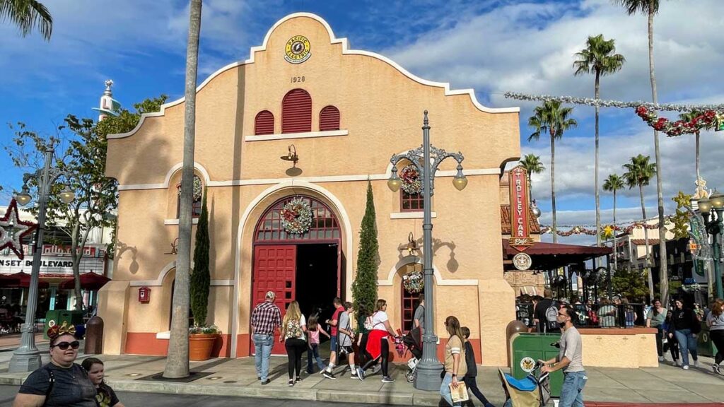
Because of this, the end of the building facing Sunset Boulevard feels like the “main” façade even though the signage that announces the entrance to the coffee shop is around the corner.
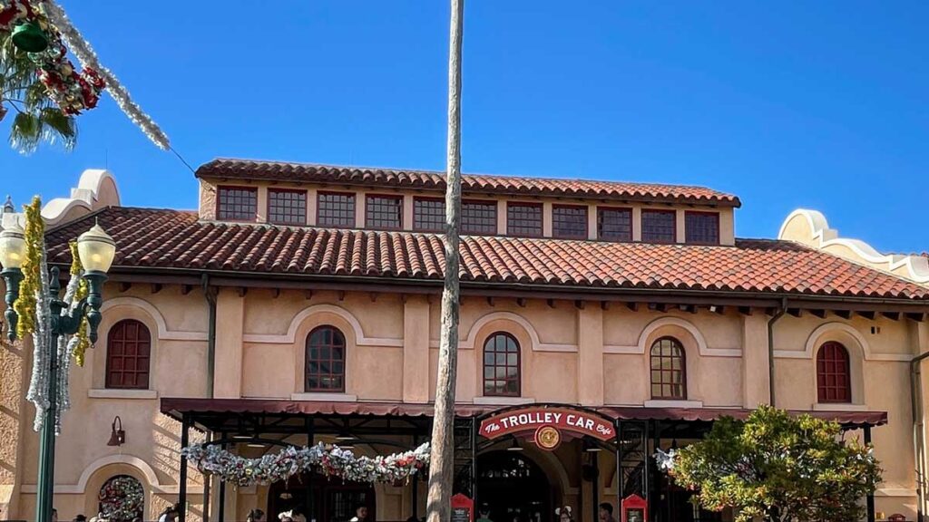
The roof of the Trolley Car Cafe isn’t a simple clean gable shape. Instead, a monitor (a raised area of roof hosting windows or louvers) running along the length of the roof ridge interrupts it. Monitors were common in roofs over large interior spaces. Before central air conditioning, they encouraged natural cooling by providing ventilation through windows or louvers. That way, the rising hot air could be exhausted. Kinda like an over-sized ridge vent on your roof at home. Additionally, they allow light to penetrate deeper into the large cavernous spaces below. In our case, clerestory windows (windows above eye level) do indeed bring natural light into the cafe Starbucks.
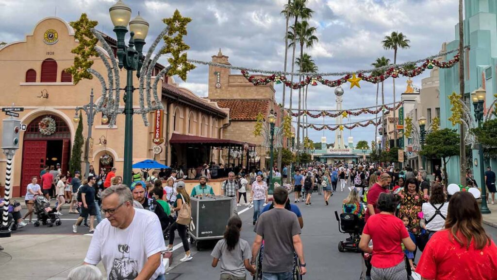
The last big picture item I’ll mention is that the building sits 10 feet back of the adjacent building. You can see that above. While all of the other buildings on Hollywood Boulevard sit tight to the sidewalk, here the building steps back for some more breathing room. Spatially speaking, that helps to announce the important intersection that guests are about to come upon. When the perceived space gets wider, it usually is trying to tell you that it is hierarchical. (That’s a fancy way of saying “more important”.). Even though Sunset Boulevard was part of the Phase 2 expansion of Hollywood Studios, the architecture of the Trolley Car Cafe seems to have anticipated that a prominent intersection was potentially coming along.
Occupying that 10-feet zone, is a small terrace that adds a layering to the streetscape. Things like terraces and porches read as semi-public / semi-private zones that are a “softer” transition between the public street and the private interior of a shop or home. Here, an awning covers a large portion of the terrace. So it seems even more porch-like – still an outdoor space, but covered… again, kind of in-between public and private. Disney hasn’t utilized this space for some outdoor cafe tables, which would really activate the street. I think they’ve missed an opportunity there. Instead, the terrace isn’t really used for much of anything.
Historical Precedent
Our building at the corner of Hollywood and Sunset Boulevards is based on an actual historical building in Los Angeles.
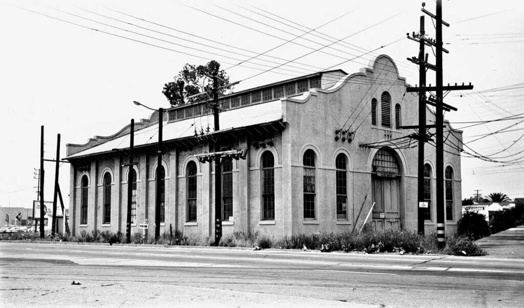
The Ivy Substation in Culver City (pictured above) was built in 1907 by the Los Angeles Pacific Railway. It’s purpose was to provide power to the Balloon Route Trolley line. It’s still standing, by the way, although it’s now a 99-seat theater. The building is on the National Register of Historic Places due to its significance as a surviving piece of Mission Revival architecture.
The Trolley Car Cafe is very faithful to its precedent, so I’ll just mention a few small variations.

- First, it is approximately a 2/3-scale replica, and some of the proportions are a bit “squatter”.
- While the Ivy Substation’s side elevations consist of 7 bays (the space between architectural elements), our version has only 5.
- The Trolley Car Cafe reads as a two-story building on the exterior, as it turns the tall double-height arched windows of the original into a pair of smaller windows – one above the other. As a result, Disney added a second decorative band that encircles the building. Each of the bands is in line with the spring-line of the arches.
- As you can see above – albeit in shadow – Hollywood Studio’s version replaces the lower windows in the middle three bays with large arched doorways. This helps establish this façade as the main entrance to the cafe. The “main” façade is really the one facing Sunset Boulevard.
- The Disney version adds an additional flared base element to the bottom corners of the main wall facing Sunset Boulevard. The Ivy Substation, meanwhile, has a simpler base to the wall.
We’ll point out a few other variations down below, as we look at the various facades.
Zooming in on the Architecture
Let’s end the post by looking at the various parts of the Trolley Car Cafe in more detail.
Roof
I won’t spend a ton of time on this because the roof is so similar to the one at Hollywood Junction. I do think that the Mission Barrel tiles are a bit less “rangy” here. The color range is more narrow. The Hollywood Junction tiles have more shades of orangey-brown. And it seems like the barrel tiles are spaced more closely together compared to the Hollywood Junction roof. Decide for yourself though – it’s pretty subtle.

The eave condition (photo above) shows that the barrel tile roof has a second cap tile for durability. The exposed rafter tails that we see in Mission Revival buildings are present. As opposed to Hollywood Junction’s wood trim color, here the exposed wood fascia board and rafters are a dark brown.
As mentioned earlier, the Trolley Car Cafe has the monitor at the ridge of the roof, which brings light down into the Starbucks interior. The monitor has the same sloped barrel-tile roof and takes up about 3/4 of the length of the main roof.
Hollywood Boulevard Façade

As we’ve said, the Starbucks entry elevation is a five-bay façade (photo shown again for reference). The five bays are separated by pilasters (columns that are partially engaged with the wall), which actually support the roof trusses. The middle three bays establish themselves as entrances because they host large arched doorways. These doors rise much higher than the windows of the adjacent outer bays. The lightweight metal structure covered in the maroon fabric awning further reinforces this entry as it, too, sits in front of the three middle bays. The canopy provides shade for a front terrace that – again – really serves little purpose the way that Disney is utilizing it. Put some patio seating out there please!
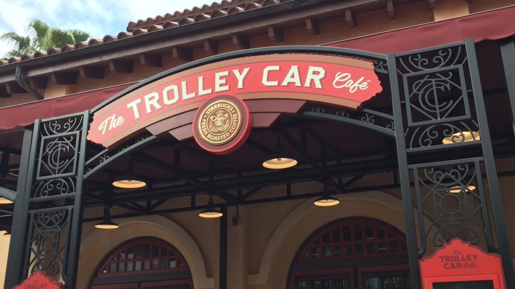
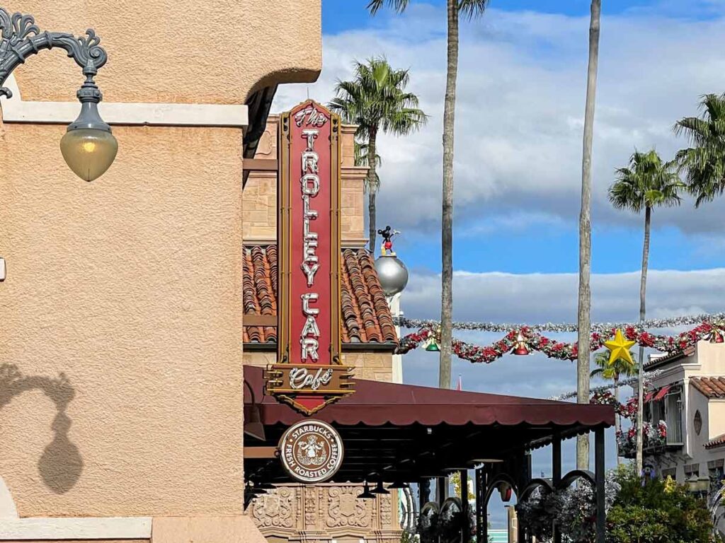
The signage for The Trolley Car Cafe (Starbucks), despite looking like it is part of the metal canopy, actually sits just in front of it, supported on the low terrace wall. The sign itself is relatively flat, and seems a bit lazily done to me… almost like it was cut from a box of minute-rice or something. But, the metal archway that supports the sign is exquisite! In Mission Revival architecture, often the ironwork provided the ornamentation on otherwise simple exteriors. Here, a “T-C-C” logo hides among the geometric and organic shapes on either side of the sign.
Moving back to the building wall, the pilasters interrupt the banding that circumscribes the building. This helps bring a sense of verticality to the building, which eliminating the tall two-story windows fails to do.
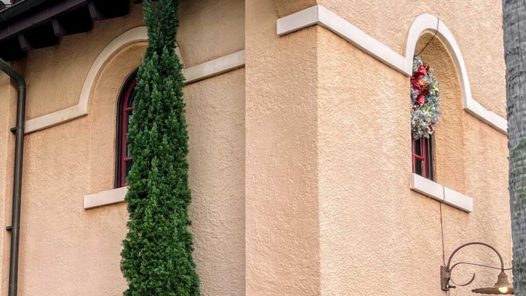
I love the deep-set arched windows. The jambs of the windows are covered in stucco and are chamfered, which makes the windows seem recessed further into the wall. It’s a bit of a visual trick because it makes the exterior wall seem thicker. That would be true of an old adobe building in the original Spanish Mission style.
Sunset Boulevard Façade
Turning to the façade facing Sunset Boulevard – what is technically the “main elevation”, although Hollywood Studios doesn’t use it as such. We see a really beautiful example of Mission Revival architecture.
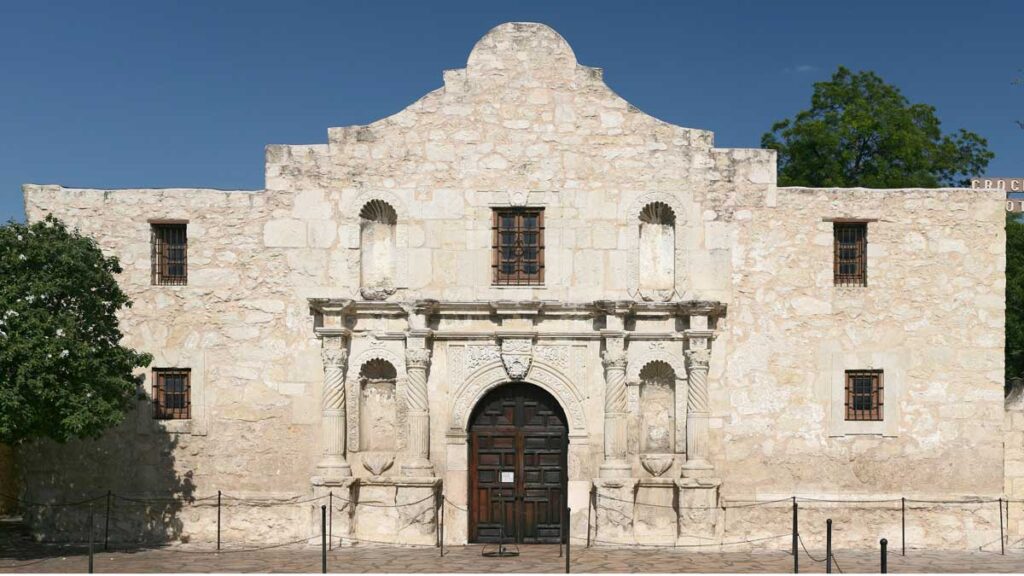
The most distinct feature of the façade is also the most distinct feature of the Mission Revival style, which is the curvaceous Baroque parapet. The parapet is meant to emulate the ones found at the Spanish Mission buildings throughout the American Southwest. Above is the most famous example: “The Alamo” in San Antonio, Texas.

The shape of Trolley Car Cafe’s parapet is clearly influenced by the Alamo’s. A projecting lighter-colored coping, which matches the projecting stucco bands that continue uninterrupted across the façade, crown the parapet. There are no piers or pilasters to break them up. The stacked windows that we saw on the side façade repeat here. They frame a giant, double-height arched doorway. It’s so large that the trim of its arch touches the upper continuous stucco band. I’m not certain, but I would assume that the doors are enormous so that the fictitious trolley substation equipment could conceivably fit through them.
A few last details:
- At the upper portion of the façade, a set of three red ventilation louvers sit atop the giant arch. In the Ivy Substation, this would have cooled the large interior space, but these are fake.
- A quatrefoil (a decorative, four-circled medallion) usually resides at the very top of the façade. But here a sign for the trolley company – Pacific Electric – takes its place.
- At the bottom of the wall, from the windowsill down, the stucco is a reddish-orange color to match the roof tiles. This is pretty typical of Mission Revival buildings.
- A beautiful neon blade sign (seen below) is attached to the side of the façade to announce the Starbucks’ presence.
Rear Facade
Let’s finish up with the rear of the building. It’s not as noteworthy as two other facades obviously, but we’ll talk about it anyway.
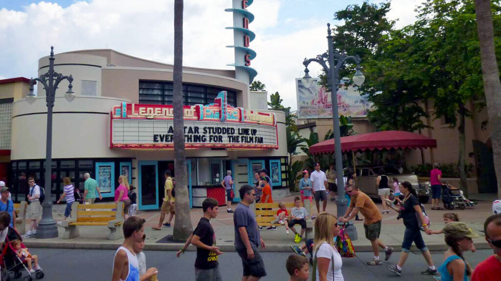
As you turn the corner onto Sunset Boulevard, the back of Trolley Car Cafe and the entrance of the Legends of Hollywood shop form a small triangular pocket park. It’s a strange little space, and serves mainly to provide an entry plaza for the shop. But, an antique Cadillac under a canopy, and some cafe tables occupy the little plaza too.

And so, the rear of Trolley Car Cafe isn’t really prominent, as the plaza primarily draws your attention to the store and the car. But, it’s there – and really does form an attractive, low-key backdrop for this little triangular park. As you would expect, it consists of the same 5-bay scheme, as that of the Hollywood Boulevard façade. But, it does differ in a few ways:
- It lacks the lower windows that appear on the other side of the building. We only get the upper windows. That means that the horizontal band that meets the arches of the lower windows of the other two facades is absent here.
- It has a wonderful planter surrounded by a low seat wall up against the building. This softens what would otherwise be a hard edge where the building wall met the pavers of the park. You can see a raised portion above where a water fountain protrudes from a tile inset panel.
- There is only one large arched doorway in the center bay of the façade… not the three seen on the other side.
- Foliage that looks like Italian Cypress trees grow close to the building, which almost give an ivied-wall-like feel.
Conclusion
OK – I think it’s time to wrap up. I hope this post fed your Disney geekdom, even if you’re not into architecture per se. But, maybe you also learned a little bit about how the architecture of buildings really help define and add character to a space or street. In my opinion, it’s what really makes the magic happen!
As for Trolley Car Cafe, I think it’s a beautiful building, and a fantastic way to prominently announce the major intersection at Hollywood Studios. I love that the Imagineers used a real historical building as the inspiration. I approve. I’ll give it my stamp!
What do you think? Comment below and let me know!


Interesting read!