Let’s get back to our series on the architectural design of Hollywood Boulevard at Disney Hollywood Studios. Part One covered Hollywood Junction. Part Two looked at The Trolley Car Cafe. We’re now making our way up the street boulevard towards the Main Entrance. As we have been doing, we’ll intersperse other architecture and trip planning posts amongst the Hollywood Boulevard posts. Next up is the building that houses Adrian & Edith’s Head to Toe (Head to Toe, from here on out) retail shop.
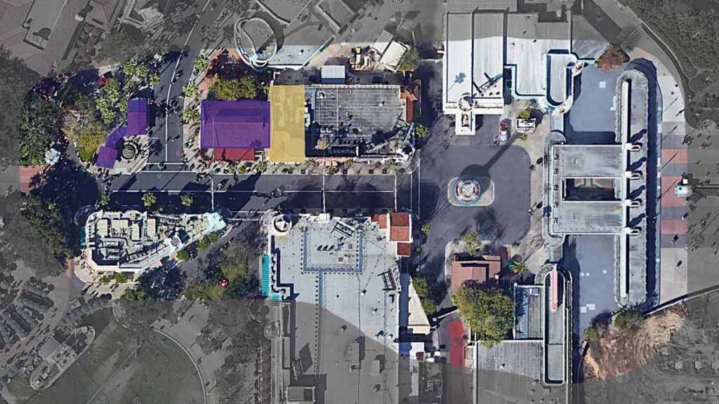
The buildings we’ve covered already are shown in purple in the image above – most recently the Trolley Car Cafe. Our subject for this post, Head to Toe, is highlighted in gold. It serves as a great, if subtle, transition between the prominent trolley station buildings at the intersection with Sunset Boulevard, and the “blend-in” storefronts of the rest of Hollywood Boulevard.
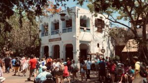
The Big Picture
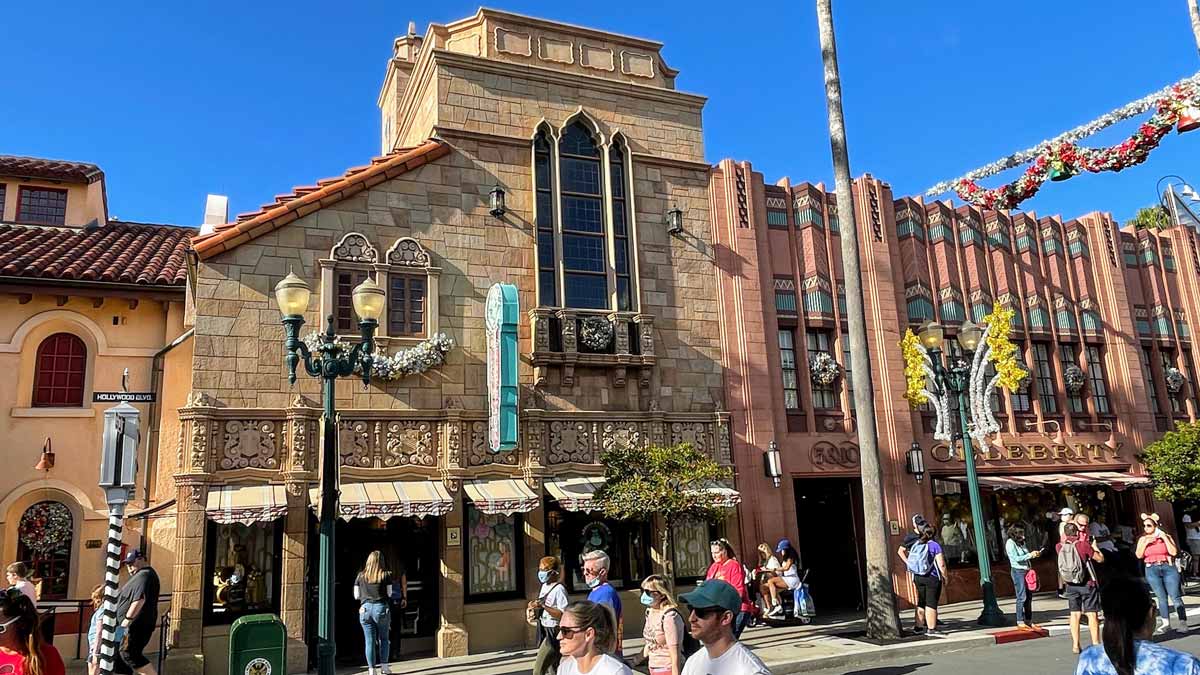
Let’s start with the initial impressions you may have when you first see the building from down the street… the big picture, if you will. We’ll dive into the detail in a little bit.
Massing
Our building plays a bigger role in the design of the Hollywood Studios streetscape than it might first appear. Because the adjacent Trolley Car Cafe sits several feet back of the rest of the buildings on this side of the street, Adrian & Edith’s Head to Toe is, in fact, a “corner” building. Usually, corner buildings have a bit more pressure on them to perform. And Head to Toe meets the challenge.
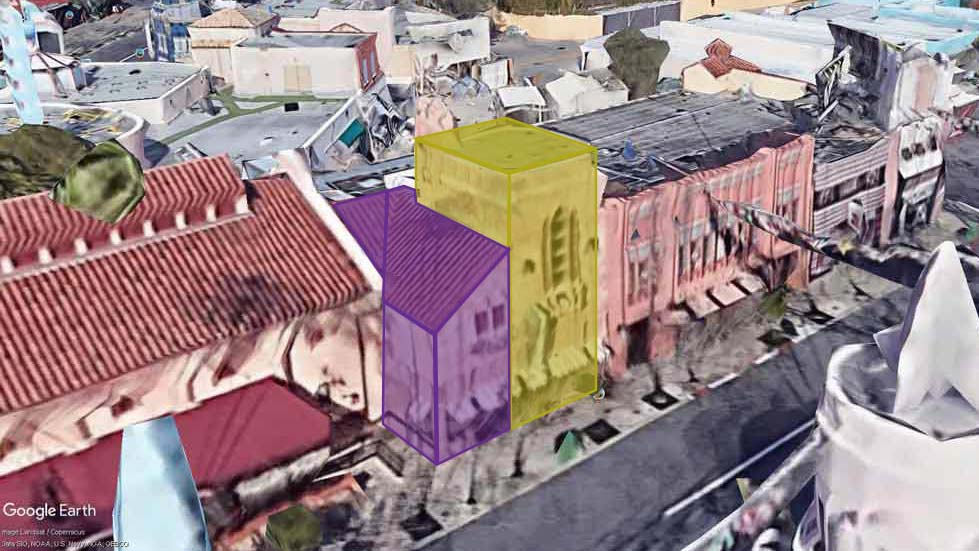
Maybe the first thing that we notice is that our building is asymmetrical. If you squint your eyes, you can see that it consists of two masses, conceptually: a thick tower element, and a shed-roofed lower mass. Google Earth’s “photorealistic 3-D Buildings” setting does you the favor of squinting your eyes for you… “You’re welcome,” says Google.
The tower makes sense here, as it serves as one bookend to the series of stores which make up the north block of Hollywood Boulevard. On the other end of the block, The Darkroom store stands on the corner of the entry plaza with an art-deco tower. Between the towers, the buildings are less heroic. Sometimes buildings like those are called “Good Soldier Buildings” – just doing their job.
But Disney has a little fun with our tower. First, they use the old “tower on a tower” trick (that’s not really a thing). Note the smaller tower sitting on the back corner of the main roof. It’s an interesting design choice because it’s really not very visible from most vantagepoints. You can, however, see it best from the central plaza in front of the Chinese Theater and near Hollywood Junction. What it does do is give a sense of depth, as if the building has more going on behind the main façade. In fact, the building that is based upon, which we’ll see in a minute, does indeed have a courtyard behind.
Transition
Usually when you have a tower, and you have a corner, you put the tower element on the corner. But here the mass of the main tower is not occupying the corner of the building. Instead, the shed roof element takes up residence there. It’s an unexpected design choice by the Imagineers. And I think it is part of what makes most people take a look at the Head to Toe building and think, “Huh. That’s a weird building. But, I kinda like it.” I haven’t taken a poll or anything, but that’s what I imagine people think.
In fact, the shed roof’s barrel tiles relate directly to the adjacent Trolley Car Cafe. So it is sympathetic to its neighboring building in a way that the tower abutting it wouldn’t be.
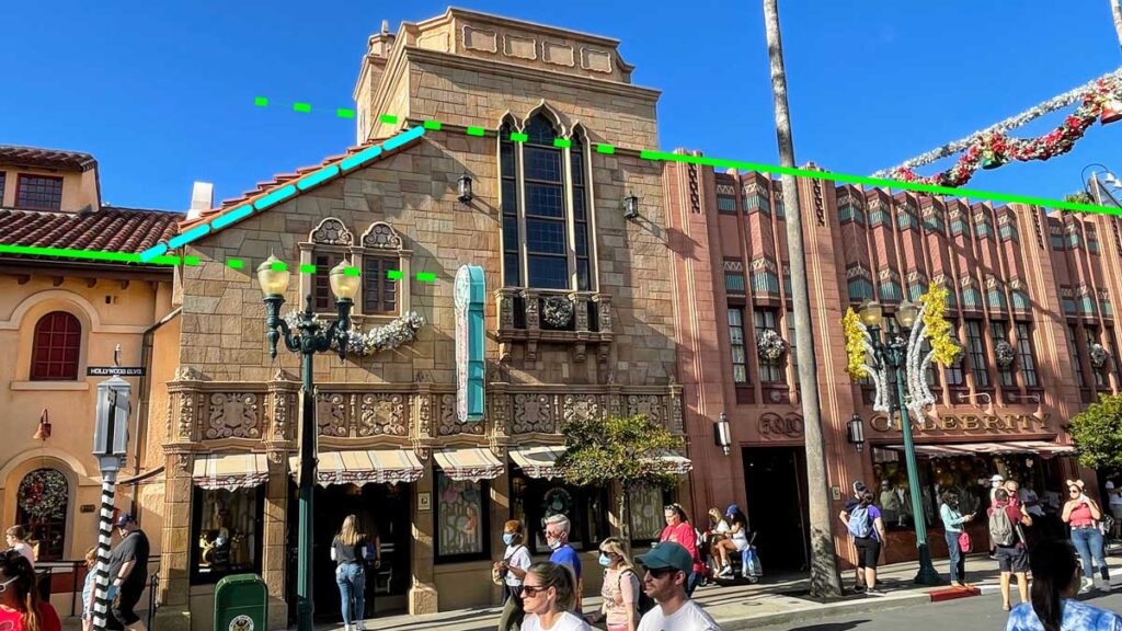
And maybe that’s the most important aspect to our building, as it relates to the whole ensemble of Hollywood Boulevard’s architecture. It helps transition from the taller façades towards the entrance, and the lower roof line of the Trolley Car Cafe. The line of the parapet of the Celebrity 5 & 10 is interrupted by the thick tower of Head to Toe, but a faint stone band continues across as an homage. The lower edge of the aforementioned tile roof nearly perfectly aligns with the height of the Trolley Car Cafe’s eaves. So our building is a nice contextual, transitional piece in the overall composition. I’ve tried to portray that above with bright lines.
Façade Design
When we look at the main building façade, we’ll see that it’s a carefully calibrated design. Despite the asymmetry, the design is very ordered.
A “façade” is simply another word for the face of a building. It’s fancy because its French. You’ll also hear architects use the term, “elevation”. But, “façade” also implies that it is a prominent feature of the building, so often the main “elevation” is called the “façade”.
Symmetry in the Asymmetry…
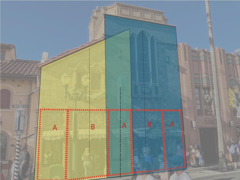
What are we looking at here? Well, the first thing to see is that while the overall building is obviously asymmetrical, the first story of the façade is very symmetrical indeed. Symmetrical means that the design is the same when mirrored about a central axis. The lower third of the building – which is a five-bay design is exactly that. “Bays” are the space between architectural elements – in this case, columns / piers. In fact, the middle bay is identical to the outer corner bays. So, we could describe the rhythm of the bays as A | B | A | B | A. Centered above each of the wider “B” bays is a collection of windows: a pair of single-height windows on the left; and an ensemble of soaring, tall windows on the right – one larger unit flanked by two thinner ones.
The imbalanced windows – even as aligned with the bays below – begin to reinforce the asymmetry of the overall façade. The smaller two on the left are proportionally squat, and the tall windows on the right mimic the taller tower in which it sits.
… and more Symmetry
But, what I find really intriguing, is that there are strong symmetries hidden within the façade design too. It’s probably most easily seen in the right-hand portion – which reads as a tower even though the tower doesn’t really read down through the building. The upward projection of the tower above the lower roof is enough for our eyes to complete the idea. With two lower “A” bays making up it’s edges – one of which is the center of the overall façade – it reads as strongly symmetrical.
The left-hand portion of the façade is more subtle. But, the paired windows help set up a similar, although not strict, symmetry, with its “A” bays forming the edges of its shape as well. So, the middle “A” bay is both the center of the overall façade, as well as the overlapping edge of two smaller symmetrical pieces. Pretty sophisticated design in my opinion… at least “kinda cool”, to use an architectural term.
Architectural Style
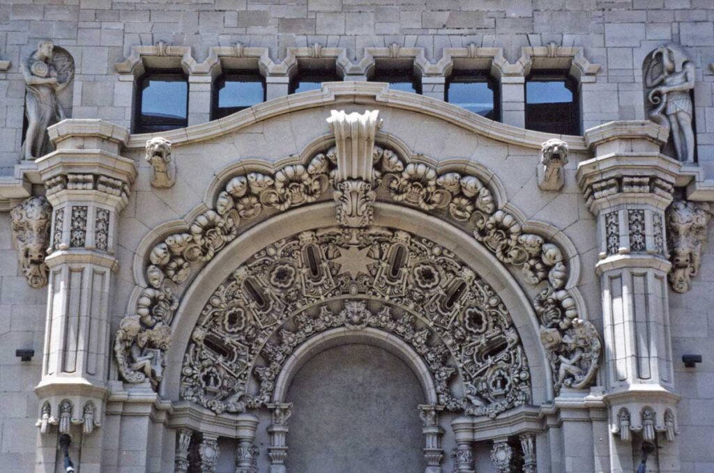
When it comes to the design of Hollywood Studios, many architectural styles are represented. So, what do you call this style of architecture? Well, I’m glad you asked. It’s called Churrigueresque, and no, that’s not a breed of dog. A form of Spanish Colonial Revival architecture found primarily in the American Southwest and Florida, Churrigueresque architecture adds highly decorative terra cotta or stone door and window surrounds to an otherwise fairly plain façade, like the example below:
Spanish Colonial Revival architecture shares a lot in common with the Mission Revival style, which is represented next door in the Trolley Car Cafe. But beyond the barrel-tiled, low-pitched roofs and smooth natural-colored walls, Spanish Colonial Revival buildings add asymmetrical facades, tower elements, and – in Churrigueresque examples – ornate details like the ones mentioned above.
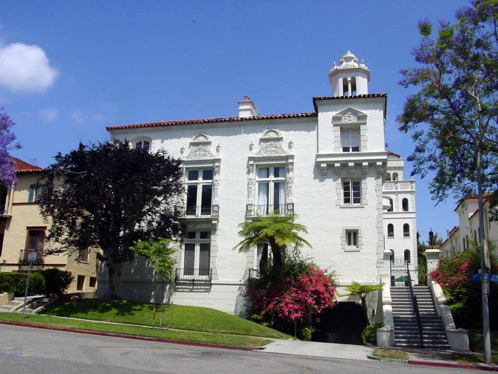
A couple of wonderful examples of the style are shown below. a more modest apartment building in Los Angeles…
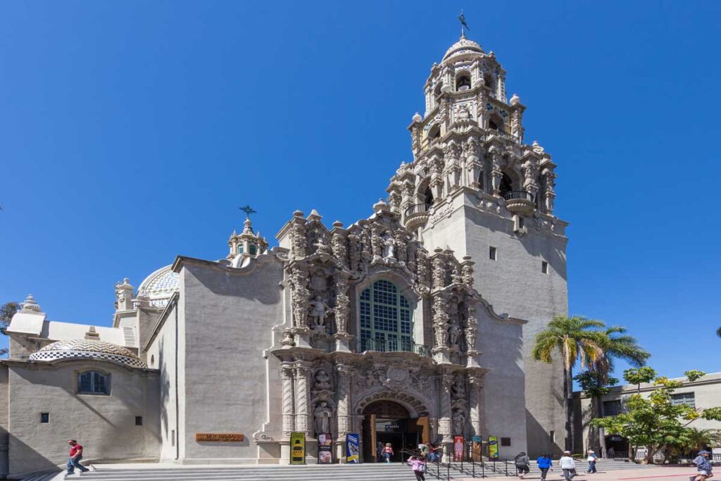
…and a more spectacular example in San Diego. It looks like something is growing on the surface of the building…
Historical Precedent
Like most of the Hollywood Boulevard architecture at Hollywood Studios, the design of Adrian & Edith’s Head to Toe has a historical precedent in the Los Angeles area.
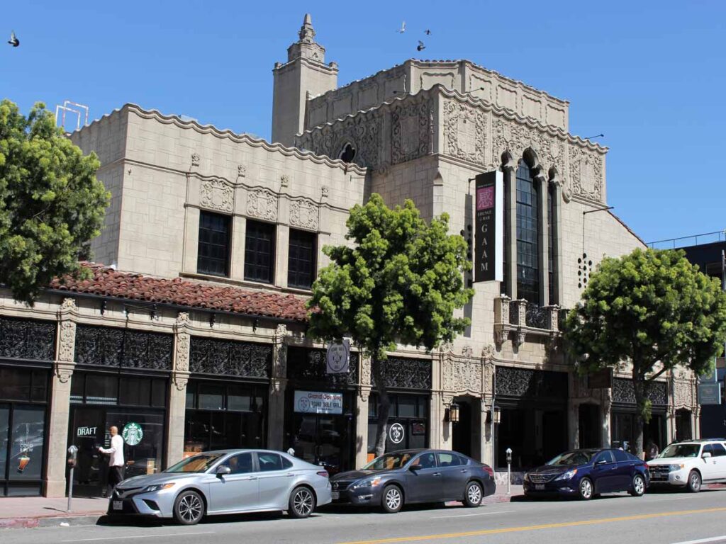
In our case, the building still stands on West 6th Street in L.A. in Koreatown. When it opened in 1929, the Chapman Market Plaza was one of the first markets which catered to automobiles. The complex took up the short-end of an entire city block with a fortress-like exterior and ornate, Churrigueresque towers on the corners. No, that’s not a Latin American salsa.
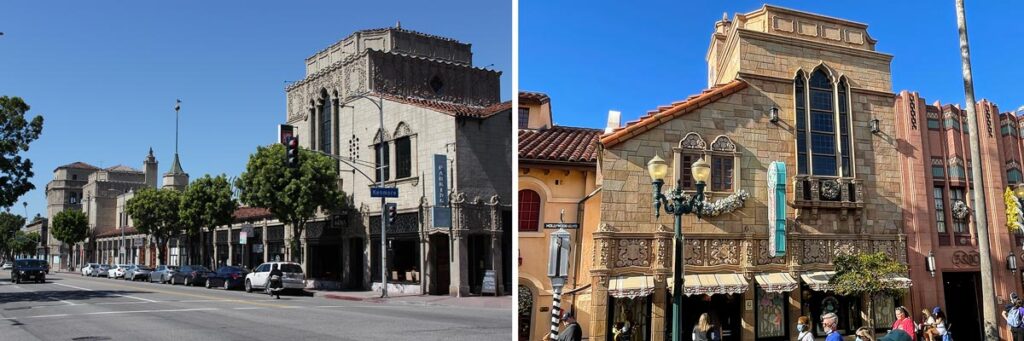
You can see in the comparison above that the precedent is a mirror-image of Head to Toe. However, the Disney version is a fairly accurate facsimile otherwise. The proportions are a bit different: the Chapman Market building’s tower is squatter, and Head to Toe’s first story sits a bit taller. And the colors are more saturated at Hollywood Studios – they “pop” more.
In addition, the minor “tower-on-a-tower” is there in the historical precedent too – most visible two images above. There is more Churrigueresque detailing (no, that’s not a deep-fried burrito… and I’ll stop now) at the top of the original’s tower, but otherwise the version at Hollywood Boulevard emulates the opulent stonework fairly accurately.
Zooming in on the Details
Let’s end by looking at some of the details.
Turning the Corner
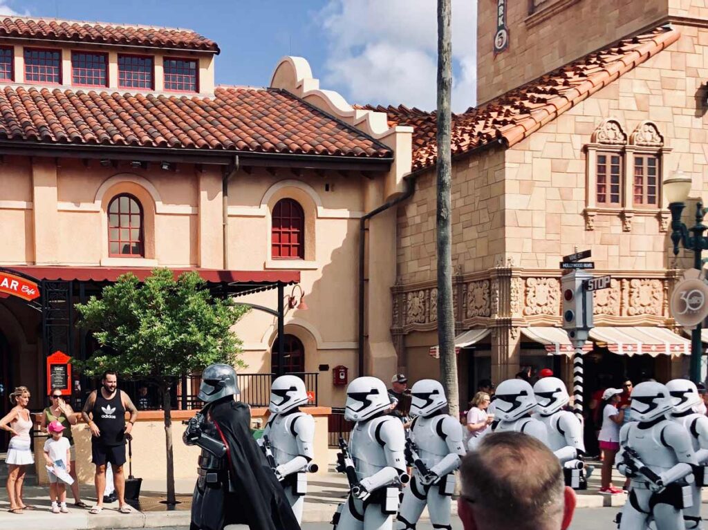
Just another parade of Stormtroopers ignoring a Stop Sign… they’re above the law I guess… This angle of Head to Toe shows its relationship with the adjacent Trolley Car Cafe best. You can see that the frieze (a highly-decorative band sitting atop columns) above the first-floor storefronts wraps the corner and returns back to the wall of the neighboring building. There’s a little clunky moment when Trolley Car Cafe’s base of the wall protrudes and kind of hides the last pilaster (a column not freestanding but engaged with the wall) of Head to Toe. Check out the beautifully intricate stone pattern in the main wall surface. I’m pretty sure it’s just a stucco/plaster finish, but the applied detail is stunning.
You also get to see how the barrel-tile roof relates to the barrel-tile roof next door. There’s not as much range in the color. And the tiles flare out a bit more as they lap over each other, causing a bit more texture. And how about the downspout from Head to Toe’s roof jumping over to the other building to spill its water on the sidewalk in front of the Starbucks? “Here… you deal with it!”
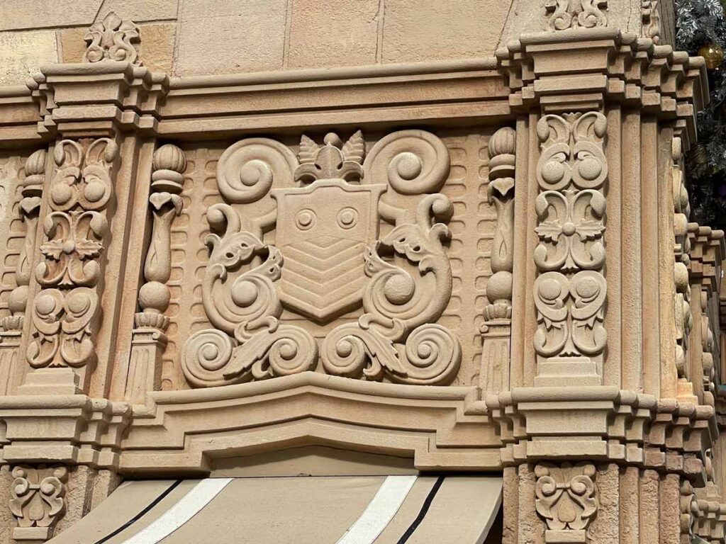
This is a zoomed in image of the carvings in the frieze above the shop awnings. There is an amazing amount of detail here, portraying an ornate, hand-crafted aesthetic for the building. A lot of the imagery and detail is organic and plant-like, including the ornaments atop each column. I think these little finials, though subtle, help announce each pilaster as your eye runs across the pretty busy frieze. Note also the layered stepping of the pilasters as it projects from the wall. The corner version, with its 5 “steps” is really compelling from this angle.
Signs and Windows and Balustrades
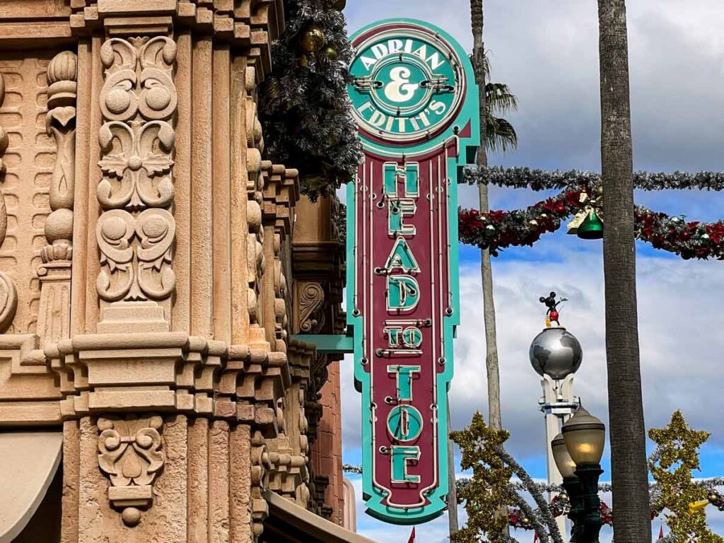
Like most of the signage on the 1930s-era Hollywood Boulevard, the building sign has neon lights and uses an Art Deco-inspired font. Signs affixed to the building like this – perpendicular to the wall, facing up and down the street – are referred to as “blade signs”.

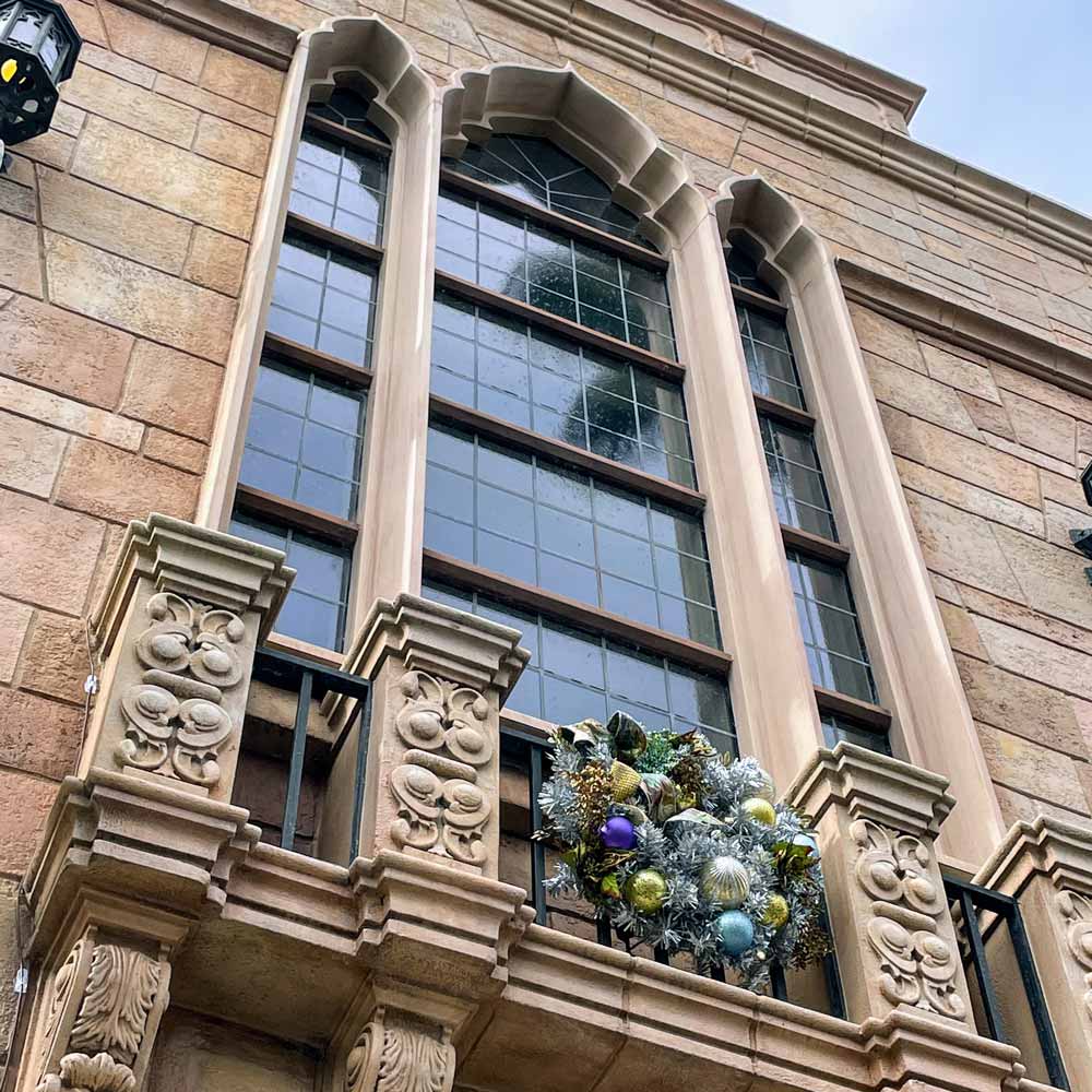
Above are close-ups of the two sets of windows on the façade. The tall, slender ones in the lower photo are topped with sinuous ogee arches that seem to be inspired by Islamic architecture. The balustrade under the windows, containing carved elements we saw in the frieze earlier, is supported by brackets projecting from the wall below. Were this a real second story, and this balcony were to be usable, the windows would continue behind it and host a pair of glass doors for access.
Conclusion
You may not have stopped to notice Adrian & Edith’s Head to Toe before. Hopefully, after reading this, you will take a minute on the way out of Hollywood Studios to appreciate the design. It’s one of my sneaky favorites at the Studios because I love how quirky and wonderful it is! Everything doesn’t, and shouldn’t, have to be perfectly symmetrical in this world – we need a little whimsy in our lives! I approve. I’ll give it my stamp!