As we continue to explore the architecture of the Disney World parks, we are going to settle in Hollywood Studios for a few. We are beginning a series on the buildings that make up Hollywood Boulevard. We’ll plan on starting on one end of the street and go down one side and back the other.
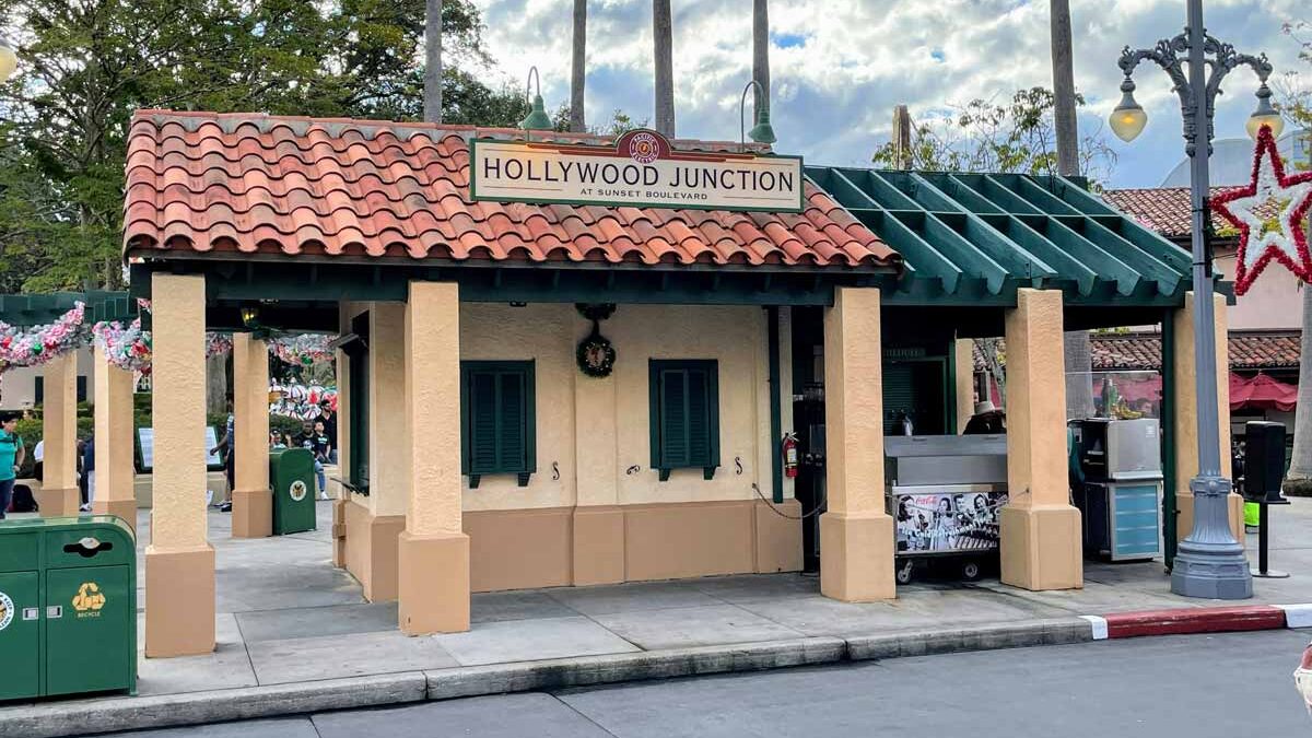
We’ll start by looking at a structure in a very prominent place in Hollywood Studios. At the intersection of Hollywood Boulevard – the “main street” of the Park – and Sunset Boulevard, sits Hollywood Junction, right across the street from what is now called The Trolley Car Cafe. Although it is a fairly modest building (you might not have even noticed it as you walked by) it is arguably in the most heavily-trafficked location in the Studios. Let’s take a closer look…
As you would expect from Disney, Hollywood Junction has a backstory.
The Trolley Story
So, let me start by pointing out that Hollywood Junction is really part of a larger complex. It’s part of a fictional infrastructure built for a non-fictional, historical mass transit system.
That historical mass transit system was the Pacific Electric Railway System, aka “The Red Cars”. Pacific Electric was an actual streetcar company, which operated in the Los Angeles area until the freeway system made them unprofitable. That’s the actual logo from the company above.
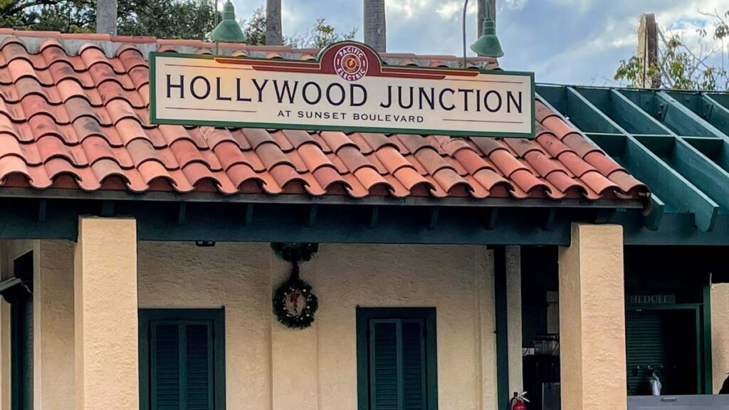
And that’s that same logo on the Hollywood Junction signage. It’s pretty cool that Disney would use an actual trolley company to build the backstory, and to immerse you in the theme of Old Hollywood. However, there is another reason: Who Framed Roger Rabbit?
Hold on… Roger Rabbit?
I wouldn’t blame you if you don’t recall that the closing of the Pacific Electric Railway Company was part of the plot of that movie. But, you probably do remember that the movie was set in Old Hollywood – just like Hollywood Studios (then MGM Studios) is. In addition, the movie was coming out just a year before the Park (which opened in 1989). Therefore, it seemed wise to Disney to integrate details from Who Framed Roger Rabbit? into the architecture of Hollywood Studios.
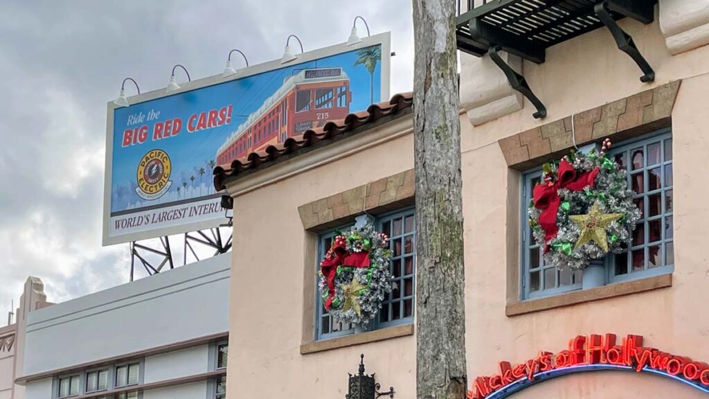
And so, in order to leverage the movie, Disney themed the building that is now known as the Trolley Car Cafe, as “Pacific Electric Pictures”; they placed a billboard for Pacific Electric in the entry plaza at the end of Hollywood Boulevard (pictured above); there is a Roger-Rabbit-shaped hole in a window above the Hollywood & Vine restaurant. These are all nice Easter eggs from the movie.
Back to the Design of Hollywood Junction
OK – back to our subject matter. In July 1994, the first major expansion came to MGM Studios – Sunset Boulevard! This new street was supposed to have Roger Rabbit-themed rides, and… an active trolley line! But, due to legal issues, the rides never came to fruition. However, the trolley idea stayed.
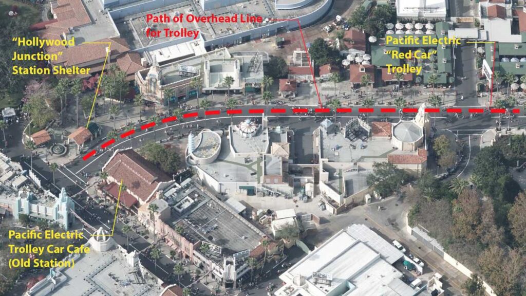
A Pacific Electric Red Car-themed gift cart sits 2/3 of the way down Sunset Boulevard, looking very much like one of its namesake trolley cars. And if you follow the overhead electric line along its route, you will find that it terminates at our Hollywood Junction station – at the intersection of Sunset Boulevard and Hollywood Boulevard. You can even see trolley rails poking through the asphalt near the end of Sunset Boulevard to help complete the theme.
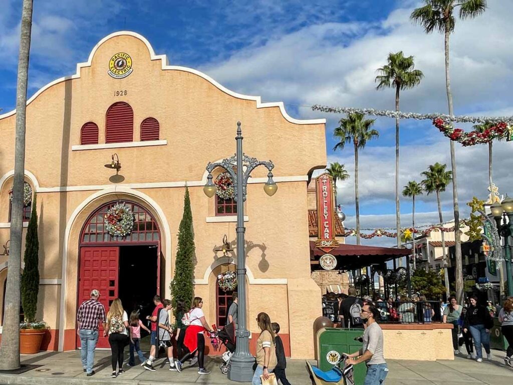
Back to the Trolley Car Cafe… Yeah, guess what logo it has on the side of the building? Yep – that’s right. This is the Pacific Electric main station / trolley storage / electric substation / ticketing building. It’s been hard to follow over the years. It’s at least one of those, if not all. And Hollywood Junction is the station shelter – where you stand and wait for the trolley, and maybe get a last-minute ticket to ride. So, it’s closely related to the Trolley Car Cafe building, even though it was part of the Sunset Boulevard expansion 6 entire years after the Park opened.
It’s worth mentioning that Hollywood Junction doesn’t serve much functional purpose today. It was once home to a Guest Services office, a Tip Board with ride times, Fastpass kiosks, and a small retail shop under the pergola. But now, it simply hosts an ice cream cart and an ATM. Looks cool though.
Planning Design
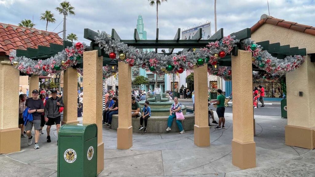
At a distance, Hollywood Junction’s design is simply two tile-roofed structures, connected by an open pergola (trellis). And these frame a ground-level fountain, which provides a public place for people to gather and/or wait for a fictional trolley.
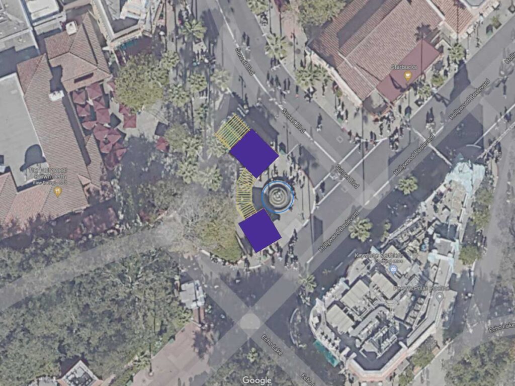
Above, you can see that the slightly larger structure sits directly opposite the Trolley Car Cafe and has a pergola attached to it. This pergola mimics the roof shape with open wood framing. The other smaller structure fronts Hollywood Boulevard and sits just slightly askew. It is connected to the other structure with another segmented pergola.
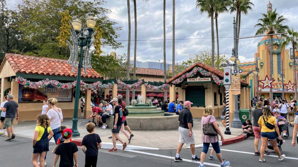
And that ensemble forms a backdrop for the 16-foot wide fountain. It’s probably the fountain that you remember most about Hollywood Junction, more than the structures. But, this blog is going to cover the architecture of both Disney World’s “hero buildings”, and its so-called “soldier buildings”. The soldier buildings are ones that simply do their job and support the wonderful moments like the fountain. The hero buildings, on the other hand, are ones like Cinderella Castle.
Architecture Geek Moment
- The pergola between the two buildings is segmented because although it may seem curved, it is in fact three sections of pergola connected at slight angles.
- A pergola is what many call a “trellis”. But, technically this is a pergola – a structure with posts, beams, and rafters that define an outdoor space. A trellis is a simpler lattice-like wall that supports plants. The terms are often used interchangeably, but since I’m in geek-mode, I’m going to make sure we distinguish them here.
Architectural Style
Hollywood Junction’s architecture is of the Mission Revival Style. This style of architecture was, and is, extremely popular in Southern California, and in other southwest states. Most popular in the late-19th century and early-20th century, this architectural style draws upon the design of the Spanish missions in California from a century prior.
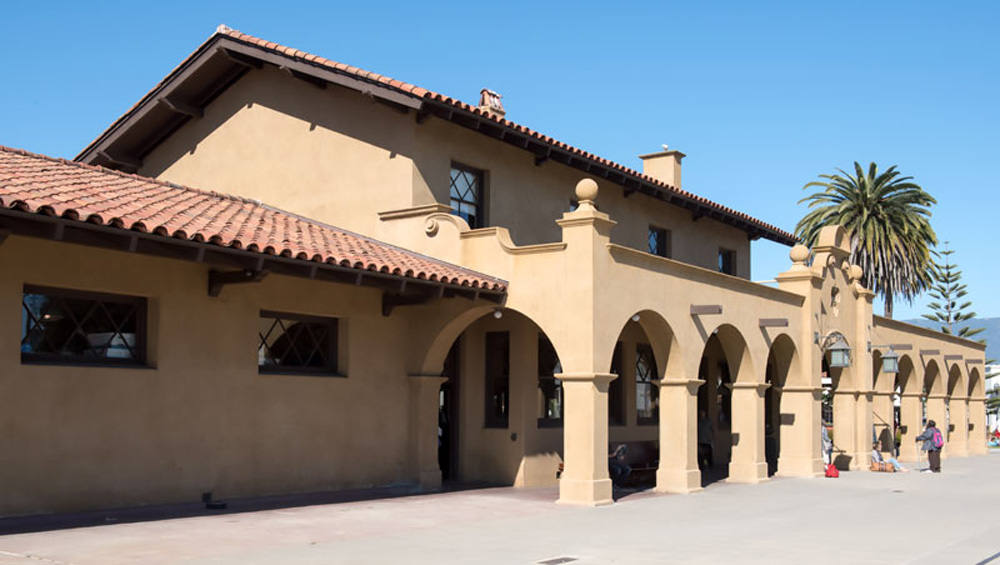
This style emphasizes unadorned stucco walls, limited fenestration (openings, such as windows and doors), and low-pitched, clay tile roofs with large projecting eaves. The above picture is of the train depot in Santa Barbara. You can easily see the fairly blank walls and overhanging eaves, which provide shade and protect the adobe bricks from the occasional rain. Train depots, in particular, were often built in the Mission Revival style of architecture. Note also the exposed wood rafter tails, which are characteristic on these roof overhangs.
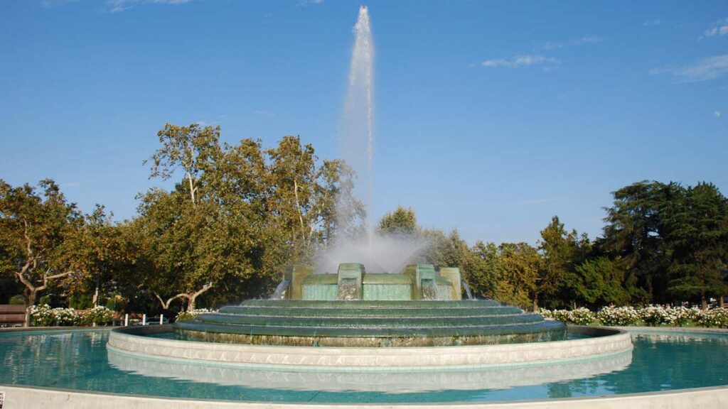
Mulholland Fountain at Riverside Drive & Los Feliz Boulevard, in Los Angeles, is the inspiration for the Hollywood Junction fountain. Even though it’s at something like 1/6 scale of the original, the Hollywood Studios version uses the mosaic turquoise tiles, and the tiered waterfall scheme.
A Little Closer Look – The Massing
As we zoom in a bit closer from the site layout of Hollywood Junction to the buildings themselves, it becomes clear that they consist mainly in covered outdoor space. There is actually very little indoor space between the two buildings.
This makes sense for what amounts to a shelter to wait for a trolley and a small ticket booth. And so the Mission Revival style, with its aforementioned overhanging eaves and pergolas, is perfect for both the function of Hollywood Junction, and its setting – World War II-era Hollywood.
The northern-most structure consists of a small ticket office, with the pergola to the north. But there is a loggia (a covered walkway) that wraps two sides of the building and gives shade to anyone waiting for their (fictional) tickets. Once upon a time, the windows that are now shuttered were actually used as ticket windows.
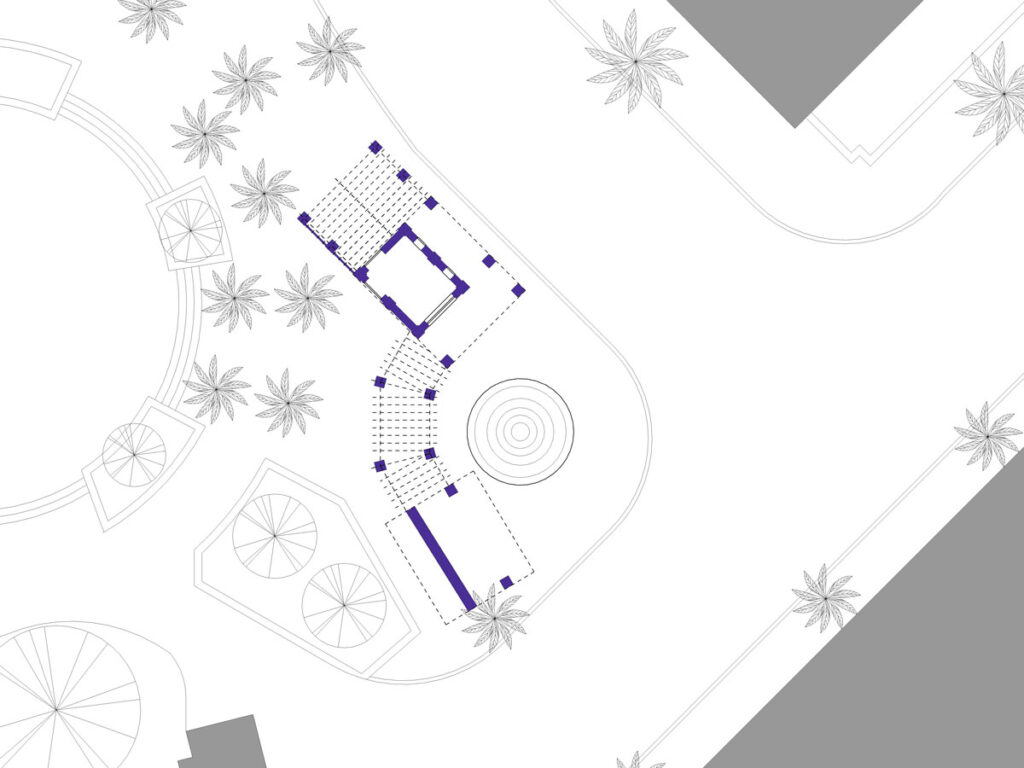
The southern-most structure is really just two columns and a solid wall, serving as a billboard, and holding up a tile roof. Seen in the site plan above (with just walls and columns shaded), it’s easy to see how simple this little building is. In fact, it is clear that Hollywood Junction is almost entirely an outdoor covered walkway and pergola, surrounding a very small room. I think it’s a brilliant little piece of architecture, and surprisingly simple.
Textures and Colors
When you get a little closer to Hollywood Junction, you notice the colors and the textures of the architecture.
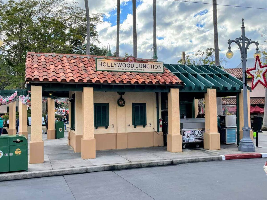
As expected from a Mission Revival building, the Imagineers used just a few materials. Stucco, a durable exterior plaster, covers the walls. The roofing is a red clay tile. And the wood rafter tails on the eaves, as well as the pergolas, are wood.
Walls
The walls – and columns, for that matter – are fairly unadorned. A few pilasters (engaged columns that just protrude a bit from the wall) are the only interruptions to the plane of the wall. The few windows and doors are simply detailed.
The stucco is painted a warm beige-tan, which happens to match the Trolley Car Cafe building, across Sunset Boulevard. Strangely, the columns are a slightly darker shade than that of the walls, which seem creamier. I’m not sure what to make of that, honestly. And, true to many examples of the style, the bases of the walls and columns project slightly, and are a darker color – an earthy light-brown.
Roof
The roof is clad with red clay tiles. Well, more terra cotta than red… Terra cotta is… clay-colored. So, the roof is really clad with orangey-brown terra cotta tiles. While the tiles are themselves smooth, due to their interlocking nature a beautiful wave-like pattern is visible.
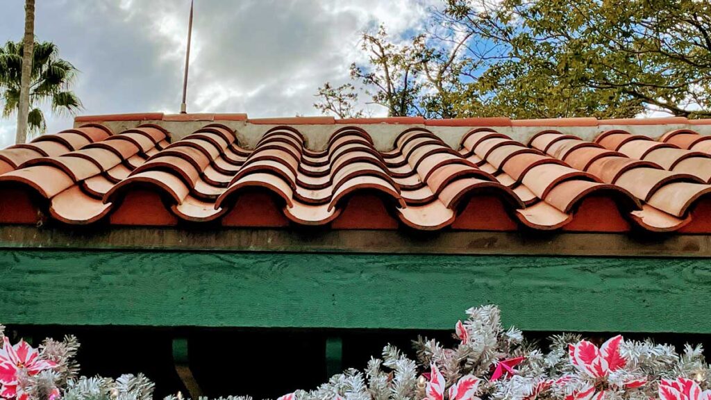
This S-shaped profile is a style of tile roof called Mission Barrel or Curved 2-piece. It consists of a convex “cap” tile that sheds water to the sides, and a concave “pan” tile that drains the water. These repeat across the roof in rows that lap over the one below.
Wood
The only other material we find – besides a few metal connections – is wood. This is seen in the beams and joists on the pergolas, at exposed rafter tails at overhanging eaves, and prominently in the open-web truss over the ticket window, seen below:
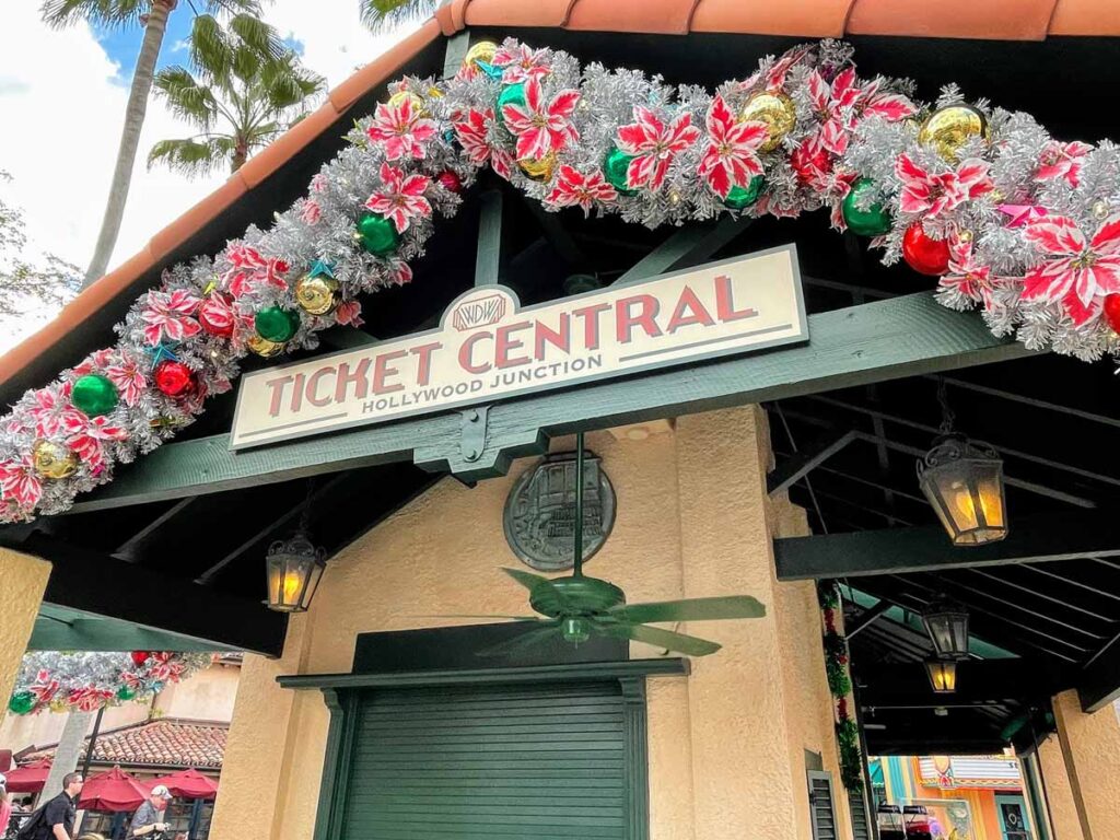
In all cases, the wood is just regular lumber painted dark green. Usually in the Mission Revival style, the wood was painted or stained a dark, contrasting color.
Details of the Architecture of Hollywood Junction at the Studios
Let’s close out this post by looking at some up-close-and-personal details of Hollywood Junction that I find interesting.
Pergola with a roof?
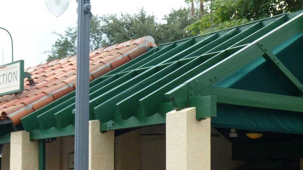
The strangest item isn’t even a detail per se, but is weird enough to mention. Presumably to provide shelter from the rain for the former retail shop (and now the ice cream cart), Disney installed a fabric cover under the north pergola. I’ll just say that this is a bizarre break from the theme. No one installs an open trellis structure overhead to then put a canvas cover under it. They just put a roof on instead of a wooden pergola. This is just a bad look. Most people don’t notice or care. But I’m paid to care… except for the fact that I make no money whatsoever on this blog.
Rafter Tails
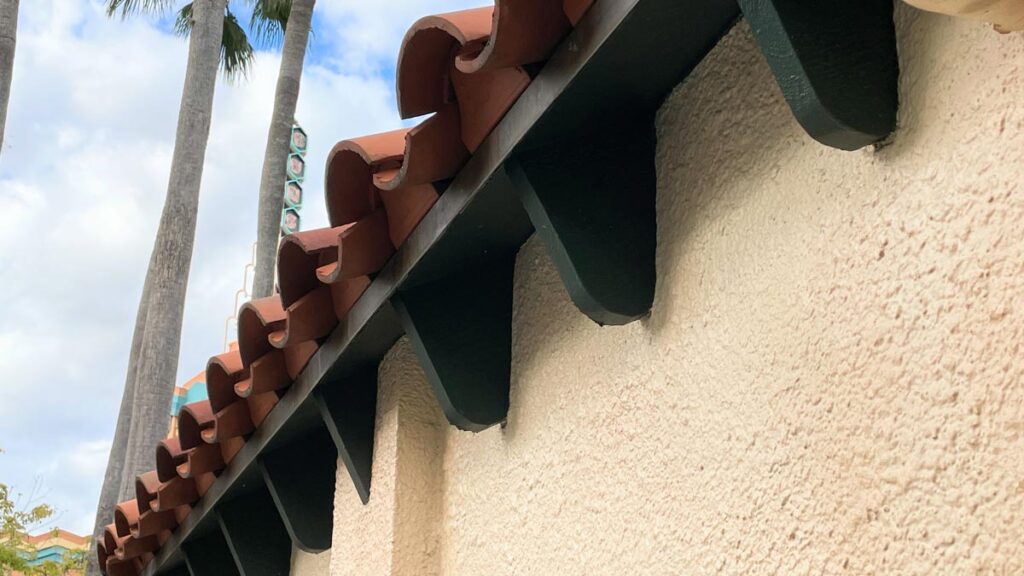
In order to allow the roof to overhang the exterior wall, the lower members of the structural roof truss (rafters) extend beyond the wall. Fascia boards and soffits often enclose these in many buildings. But, here they are left exposed, where they become rafter tails. You can find highly decorated rafter tails in many architectural styles. In the above photo of the rear of the ticketing office at Hollywood Junction. they are beautifully and subtly curved at the bottom edge. I love how they complement the sinuous edge of the barrel tiles.
Fountain Seat
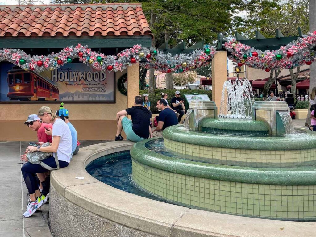
This may seem like a little thing, but, the perimeter wall being at seat height is a great way to encourage guests to enjoy Hollywood Junction. Here, guests are able to sit and enjoy the gentle sounds, and watch the kinetic activity of the water spilling over the green tiles.
Pergola Details
The central pergola connecting the two buildings has some fun little details as well.
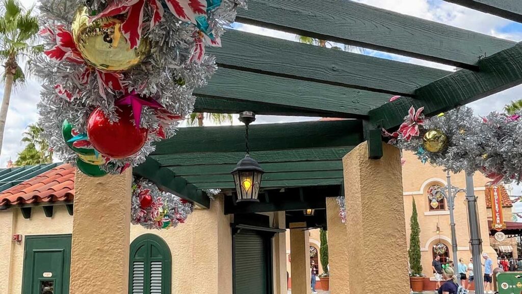
The beams that support the joists (or rafters) are slotted in to the stucco-covered masonry piers (or columns). You can see on the right side of the photo how the end of the green beam is protruding out from the column. I’m not familiar enough with the construction of Mission Revival pergolas to know exactly what’s going on there, but I think it’s an interesting detail.
The middle section of the pergola is raised up, and rests on top of the lower sections’ beams that are slotted into the stucco piers. I had honestly never noticed this before, but it’s unique. I guess it makes sense because it would be hard to have two beams at two different angles slotted into the column at the same time… Anyway, I thought it was cool.
Conclusion
Even though it’s likely the most walked-past building at Hollywood Studios, most likely don’t stop to appreciate the architecture of Hollywood Junction. But, for a humble little structure on a very prominent corner in the Park, it stands up to the pressure! The Mission Revival style of architecture ties it to the building across the street; he pergola details are compelling; and it all frames a wonderful fountain that guests can enjoy while people-watching. It’s not the most memorable piece of architecture at Hollywood Studios, but it certainly helps immerse you in the theme. It’s this level of design that helps create the magic – that allows you to believe you’re somewhere else. I’ll stamp and sign this design.
Let me know what you think of Hollywood Junction in the comments below.

I have walked this area multiple times and I have never really thought about the architecture. Thanks for giving a different perspective to think about, enjoyed the read!