Cinderella Castle at the Magic Kingdom is one of the most iconic and photographed buildings in the world. But why? Is it simply because it’s in the center of the world’s most popular theme park? No – it’s more than that… if the Castle was replaced with a grain silo, it wouldn’t be iconic or photographic. It’s the particular architecture of Cinderella Castle at Disney World that makes it so memorable and iconic. As I describe in excruciatingly long detail in this post, the architecture of Disney Parks is what helps “make the magic happen”.
As for the statistics that you can find on other sites:
- The Castle is 189′ tall.
- The Castle uses 600 tons of steel for its superstructure.
- Its cladding material is a fiber-reinforced gypsum plaster.
- The more articulated upper stories (the keep of the castle) are made of fiberglass.
- The roof tiles on the towers are made of a plastic similar to computer housings.
- The upper levels of Cinderella Castle are designed at a much smaller scale to make the building seem taller. This illusion is called forced perspective.
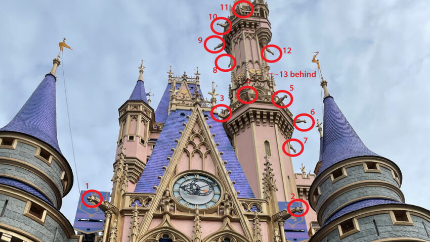
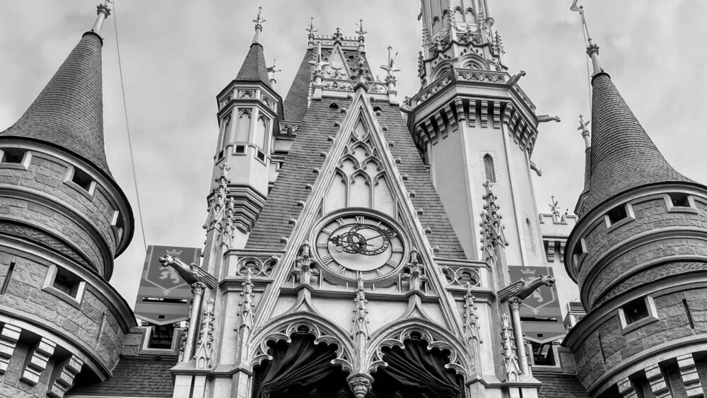
Cinderella Castle has 27 towers. Imagineers scrapped two additional towers when it became clear that you wouldn’t be able to see them from within the park. The tallest tower (Tower #20) hosts 11 gargoyles split between two different tiers. And the entry tower (Tower #10) hosts an additional 2, for a total of 13 gargoyles on the Castle.
Architectural Style of Cinderella Castle
There is no question that Cinderella Castle is a gorgeous, awe-inspiring, imaginative building. The architecture of Cinderella Castle is uplifting and compelling, and serves to draw people further into the Magic Kingdom to discover its detail. So, let’s take a deeper dive into the architecture of the Castle. (FYI – The pictures in this post span a couple of different castle color schemes. The one with the rose-pink colored upper stories is current, and was done in preparation of the 50th Anniversary of Walt Disney World.)
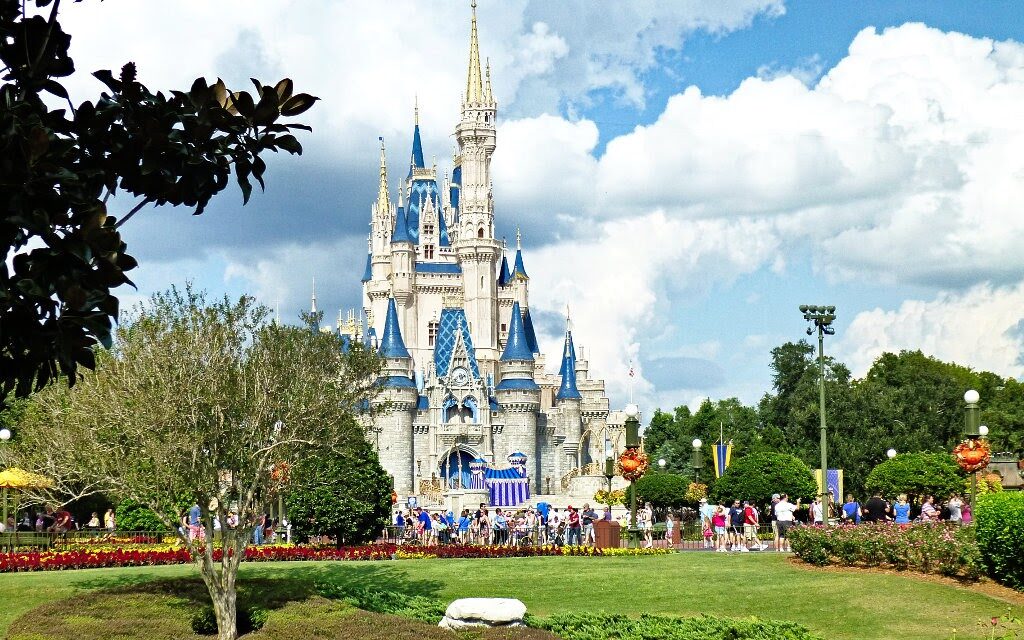
Cinderella Castle, which strongly emulates the castle from the 1950 animated Disney movie, is an example of romantic architecture – a late-18th / 19th-century style. Romanticism is a style that focuses on eccentric, emotion-inducing buildings, based upon previous historical architectural styles. Because Disney’s Cinderella is set in France, the Castle is inspired from older French styles – mainly Gothic influences. So, Cinderella Castle’s architectural style is, essentially, Neo-Gothic. There are however influences from other styles as well. We’ll talk more about some of the historical precedents in a subsequent post.
Cinderella Castle does an amazing job at serving as a piece of romantic architecture:
- It is photogenic from all angles.
- Its Gothic lines point skyward evoking emotions of awe, and producing an air of spirituality, similar to Gothic cathedrals.
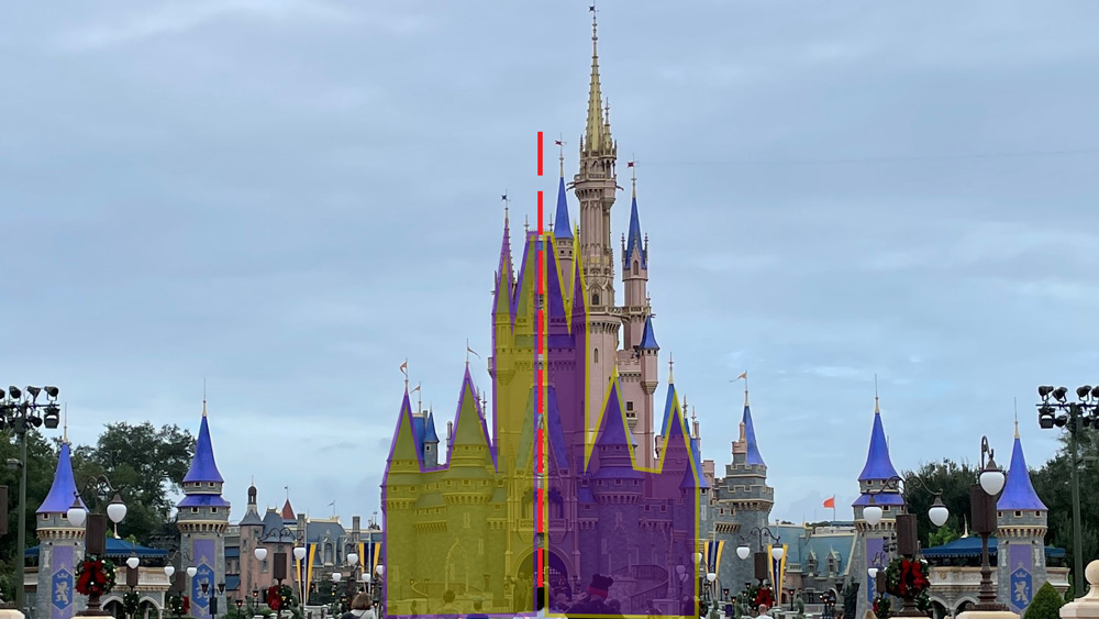
- The Castle presents a whimsical, fantastical, not-so-serious side through its asymmetry (lack of it being a perfect mirror-image about its center). This is emphasized especially in the upper stories. It doesn’t feel foreboding or stoic… it feels approachable and inspiring.
- Its (now) pink upper stories with gold trim-work also adds to the romantic eccentric feel.
Let’s continue to look at the architectural detail of the Castle through the lens of Walt Disney’s four levels of design detail, as discussed in this post.
Walt’s Level 1 Detail – Design from afar
Disney Parks use iconic structures to draw people further into the parks and the various lands. Walt Disney called these icons “wienies”, after the hot dogs with which he would tempt his dog. He found that he was able to control where his dog would go by waving the “wienie” in front of her. Likewise, the Imagineers have strategically placed icons within parks – and even in individual lands – to draw (control) where people will go. (Now, they’ll be using the Disney Genie service to control us.) While we, today, might call this a “carrot” or a “visual magnet”, Walt has stuck us with the term, “wienie”… I’m sure The Walt Disney Company is thrilled.
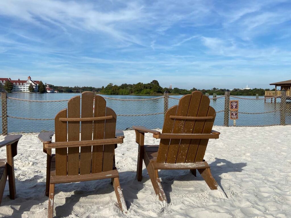
Cinderella Castle is designed to be seen from across Seven Seas Lagoon, beckoning you to cross the water on the ferry or monorail (seen just above the chair on the right). It reveals itself again once you emerge into Town Square on Main Street, USA. It’s a very calibrated sequence. In that way, the Castle serves as a wienie, both from outside and inside the park.
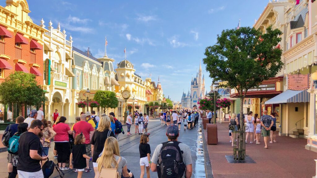
Why does it work as a wienie? It isn’t just because of its size (again, a grain silo wouldn’t draw you in). It also has to be compelling. And compelling it is. The French Gothic towers and spires create visual interest. And as mentioned before, the fact that those towers are not symmetrical makes you want to get closer to find out what is going on. We also can’t overlook the curiosity that comes from seeing a Gothic castle at the end of a small-town Main Street. That is not something you see everyday.
Walt’s Level 2 Detail – Design of the place
Next, we’ll look at the architecture and design of Cinderella Castle’s surroundings. I plan on covering this in great (too great?) detail in a future post, so I’ll be brief here.
Central Plaza
The Hub of the Magic Kingdom – the Central Plaza – serves as a front yard of sorts for Cinderella Castle. Upon its reimagining (read: widening for fireworks crowds) several years ago, it has taken on the style of a French Garden. These geometric gardens typically contain parterres (planting beds), fountains, and sculptures. Thus, in the Central Plaza, we find wrought-iron fences, fountains, sculptures, and manicured flower beds. Guests enjoy these details while taking pictures in front of the Castle or waiting for the evening fireworks.
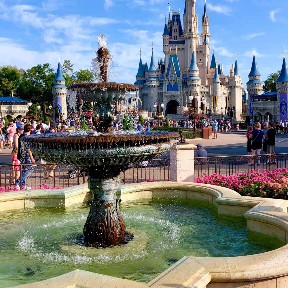
These French landscape details reinforce the Hub’s connection to the French Castle. It serves as a front yard to the Castle itself.
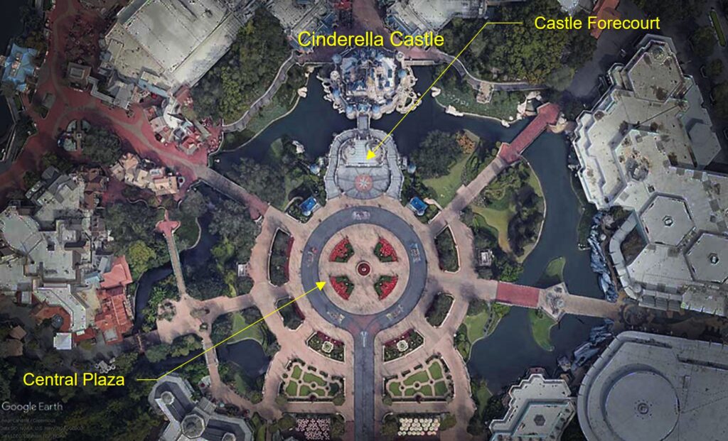
The Castle’s forecourt stands at the head of the Central Plaza. A pair of curving ramps flank the raised terrace and lead to the entrance of the Castle itself. The forecourt is largely a stage for entertainment, but it lacks any fortification or protection. So, it reads more like an extension of the Central Plaza.
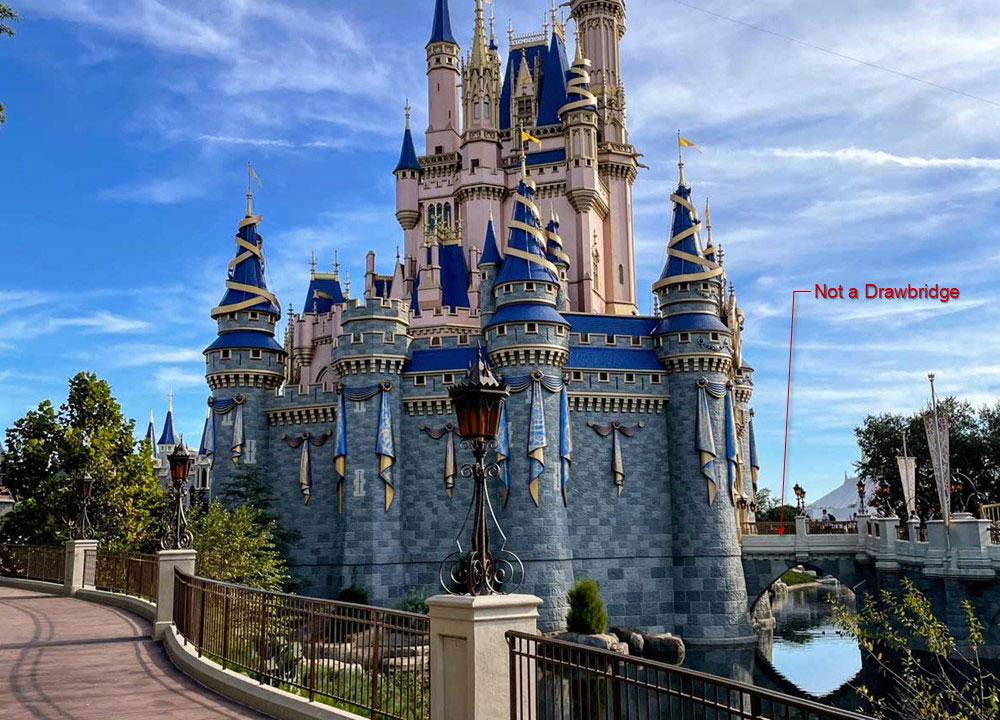
There isn’t an actual drawbridge spanning the narrow moat either. Instead, a small stone bridge connects the forecourt and the gate of the castle wall. So, it is not an impregnable castle… Cinderella must be a pretty benevolent ruler to invite the riff-raff from Main Street so freely into her castle.
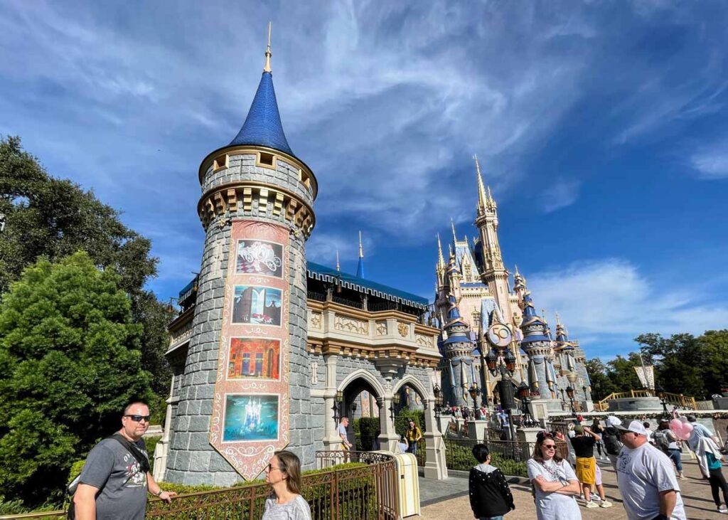
In 2015, Disney added 4 additional tower structures to the sides of the forecourt. These serve as support structures for the shows that occur on the Forecourt Stage. They also widen the visual profile of the Castle – giving it a greater presence on the Plaza.
Behind Cinderella Castle
Fantasyland – specifically the Castle Courtyard – sits directly behind the Castle. This entire area has been more strongly defined as part of the actual Castle complex by new rear castle walls, built in 2012. Prince Charming Regal Carrousel sits prominently behind the Castle in the Courtyard. According to Disney, it is placed there so that the citizens of the Castle village could take turns on the “amazing spinning contraption”.
There are a couple special site details to mention. First, Cinderella’s Wishing Well sits on the east side of the Castle along the path to Tomorrowland. Here you can sit down on a bench and take a break from your relentless touring plan!
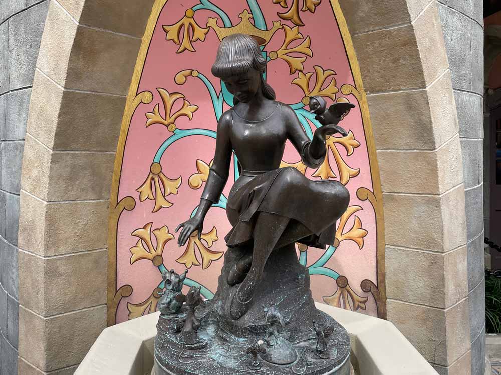
And on the west side of the Castle, right next to the Castle Couture shop, you’ll find the Cinderella Fountain. Here, Imagineers have included a forced perspective trick. When you bend down to drink from the water fountains, the statue of Cinderella seems to be wearing a crown. It’s a really fun detail!
Walt’s Level 3 Detail – General building details
As far as the main Cinderella Castle building itself goes, the design of the architecture easily breaks into two parts: upper and lower. The color scheme that Disney has most recently painted the castle helps emphasize this.
The Architecture of the Wall of Cinderella Castle
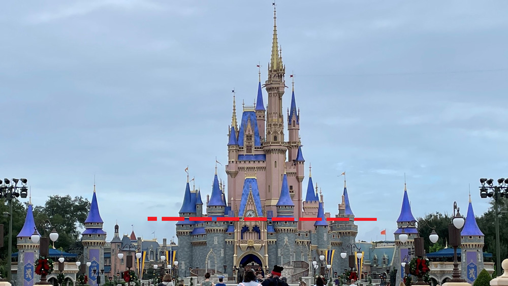
The lower portion of the building is a fortified castle wall that stands roughly 50′ above the water and wraps about 2/3 of the way around the structure. The western and eastern sides each have 4 towers that protrude from the wall. However, the Wall is subtly asymmetrical.
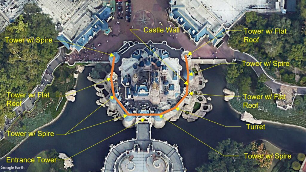
Five of these towers are topped with blue-tiled spires – tall, tapering, pointed roof structures. These cylindrical towers are engaged with, and project from, the Wall.
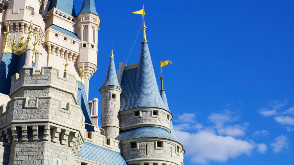
And three of the towers on the Wall have flat-roofs and crenellations – those notches in the parapet that look like “teeth”. These flat crenellated towers are not cylindrical. Two are, in fact, octagonal, and one is a 4-sided tower.
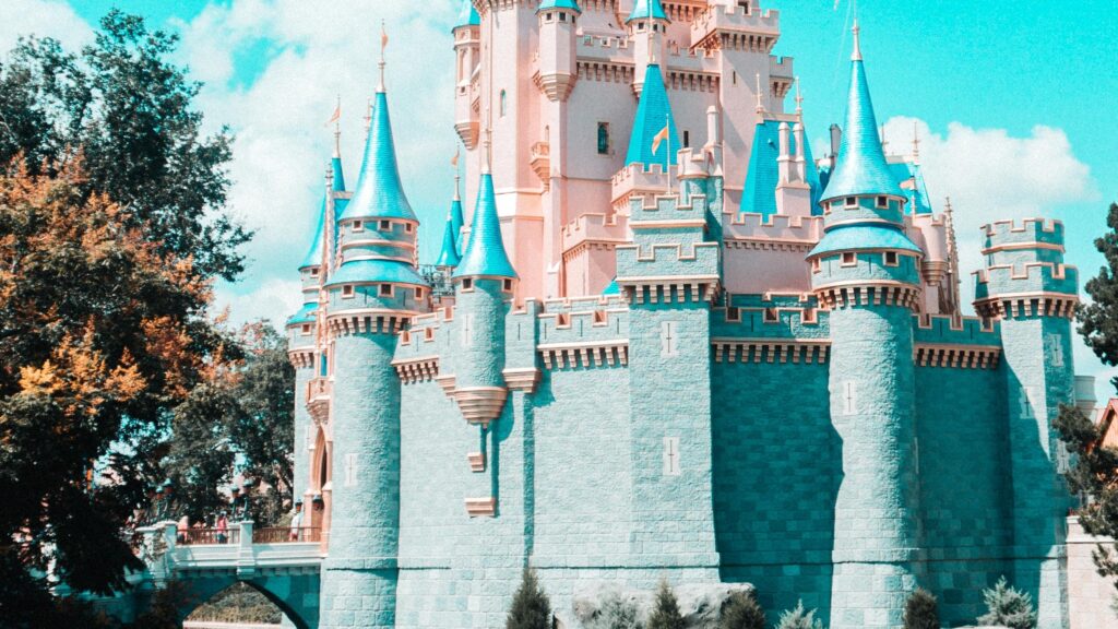
On the eastern side of the Wall, there is a large distance between the two towers closest to the Plaza. Here, we find a turret – a small tower that projects out from the wall and doesn’t continue to the ground. I love this little design detail of Cinderella Castle. It adds a whimsical idiosyncrasy to the Castle, and also interrupts what would be a visually-too-long stretch of parapet wall.
The Entrance Tower
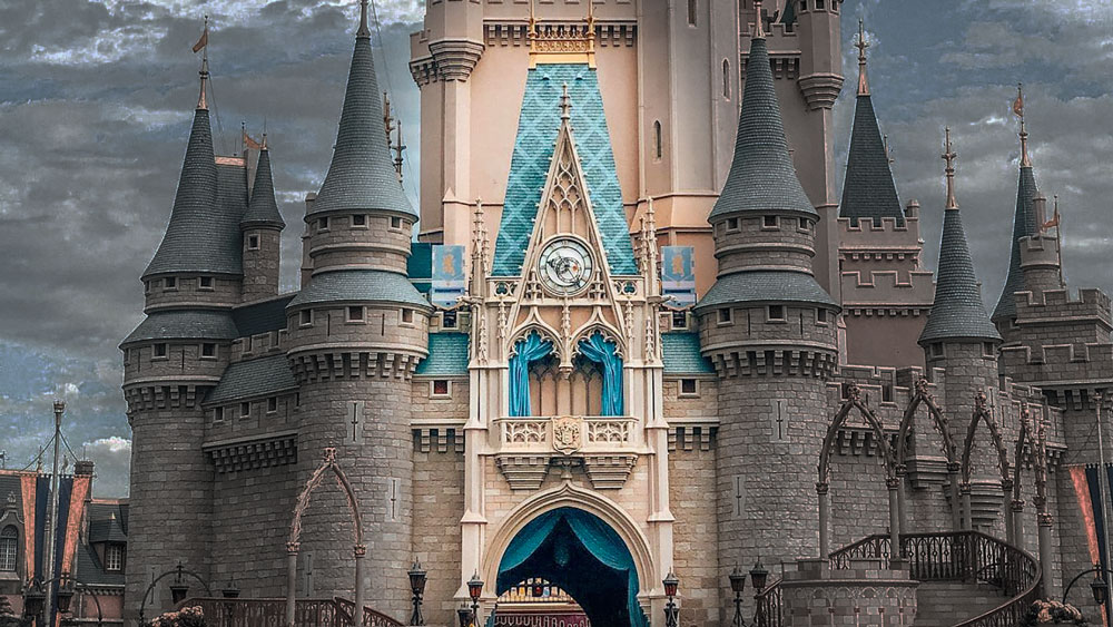
At the center of the Castle stands a wide entry tower (Tower #10) that announces itself with more intricate stonework and a unique roofline and tower. As opposed to the other strong fortified towers around the Wall, this entry tower appears more permeable. A large entryway allows us to see all the way through the Castle and into Fantasyland. A balcony with open archways stands above the entryway. And above that a clock sits within the delicate stone tracery work in the triangular pediment. This stone frontispiece looks a lot like it was transplanted from a Gothic Cathedral.
A steep four-sided tile Mansard roof – an exaggerated version of what you might find on a French Chateau – caps the entry tower.
The Rear of the Castle
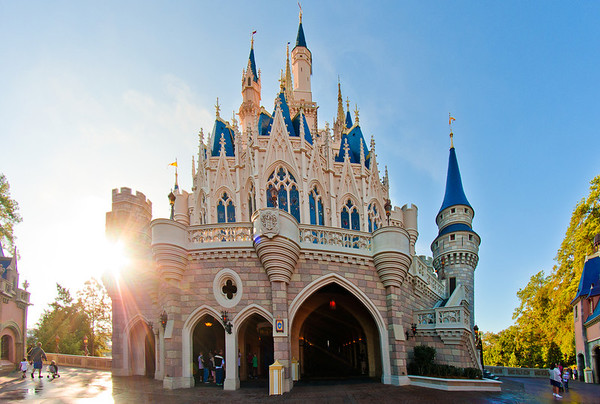
The rear third of the Castle is left “exposed” in that the Castle Wall essentially stops and reveals a more delicate stone wall. A 2nd level terrace and large windows that overlook Fantasyland is revealed as the fortified wall is discontinued. This rear façade is also asymmetrical. To the left of its centerline is a series of 4 arches and a roundlet window. Meanwhile, the right-side contains the large opening of the main passage through the castle and a switch-back stair up to the closest tower. A series of corbelled projecting balconies break up the railing at the terrace level.
Overall, the architecture of the Castle Wall of Cinderella Castle forms a strong, unifying foundation. This allows for the much-more-eccentric upper stories of the castle to be more playful and idiosyncratic. Without the calmer, straightforward, stronger wall to ground it, the Castle might appear too chaotic. But the projecting spires of the towers of the Castle Wall which interlace with the upper levels, help soften the dividing line between the upper and lower portions of the Castle.
Cinderella Castle Keep Architecture
The upper portion of Cinderella Castle is essentially the keep of the Castle – the place where, historically, the royal family dwelled. It was also usually the tallest, safest place within a Castle (thus the very tall towers). The Keep here simply looks like the upper half of the Castle from the viewpoint of the Hub. But from a three-dimensional massing perspective, we see that the keep is really nested within the lower walls. The Castle Walls, as mentioned, peel away towards the rear, revealing the keep at the lower levels.
In order to better understand how a building is organized, it’s often helpful to try and simplify it into basic masses. It’s pretty hard to boil down the conceptual massing of the keep of Cinderella Castle. It’s incredibly compelling and your eyes just want to spend time figuring out what is going on! And in this way, the design is very romantic.
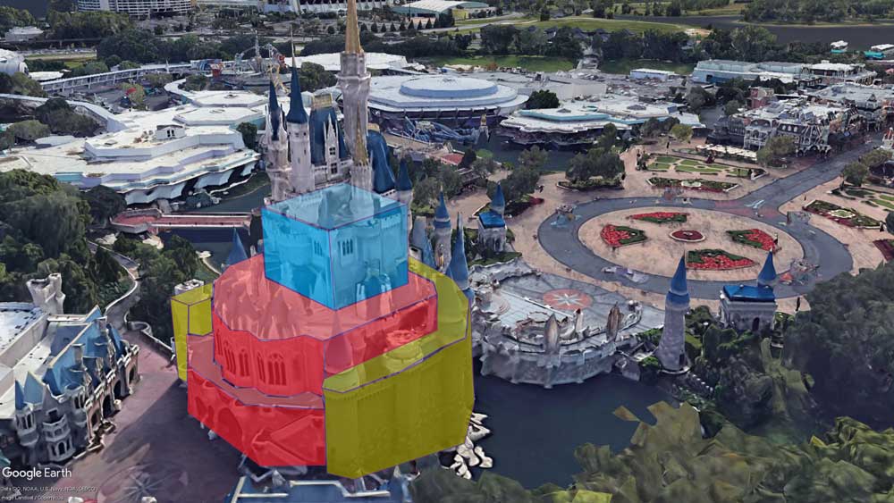
But, we can try to simplify the massing scheme a bit. There is a 2nd-floor mass (we’ll call it the “lower keep”) where Cinderella’s Royal Table is (red in the image above), which is also revealed at the first level in the rear. A larger cube-shaped block (in blue) – the “upper keep” – sits above that, which contains the Cinderella Castle Suite, and from which the tallest towers spring.
Lower Keep Massing
That 2nd-floor, “Lower Keep” mass, hosts 3 to 4 low tower roofs. These are essentially false towers with chimneys simply stuck on top of the keep roof. These imply that there are lower structures and towers within the castle walls, adding some realism to the Castle design.
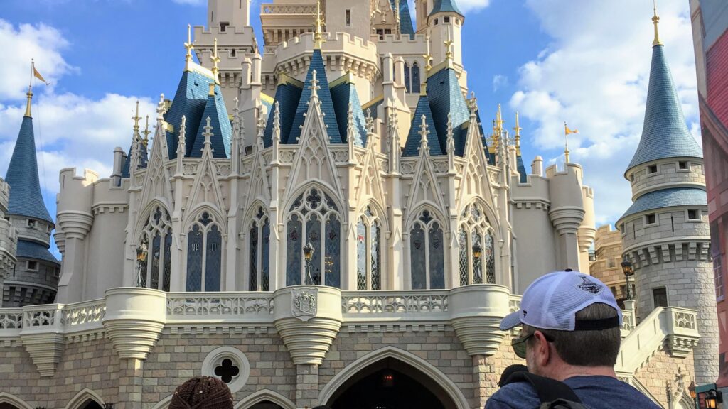
And to the rear of the Lower Keep, three projecting bays, each containing three arched stained-glass windows, again bring a Gothic Cathedral feel to the building. The face of each of these bays has a very similar stone treatment to that which we found at the front entry tower. This is a repeating detail, or motif, that ties the project cohesively together. An interesting triple-pitched roof tops each of those three projecting bays. The roofs’ multiple peaks create the appearance of even more tower spires.
Upper Keep Massing
Above the “Lower Keep”, the upper mass of Cinderella Castle is essentially a cube-shaped block with a towers attached. There is so much going on, that we simply don’t have room to discuss it all. But, we see a few distinct features:
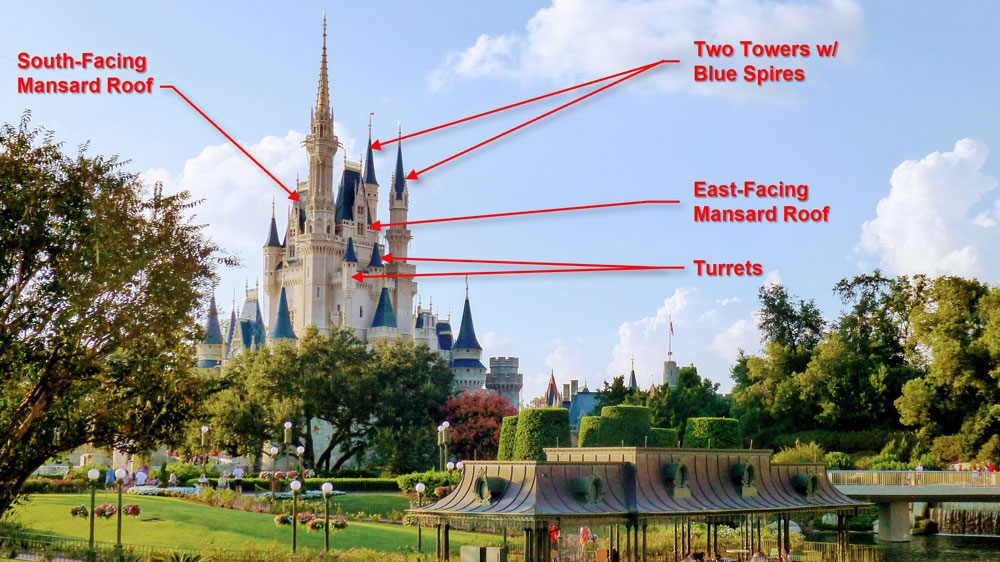
- Two tall slender, blue-spired towers sit on top of squared bases. Both of these are located at the north-side (rear) of the Castle, and are visible clearly from Fantasyland.
- Two tall pitched roofs – almost exactly like the steep four-sided mansard roof of the entry tower – sit atop the upper keep of Cinderella Castle
- One sits directly behind and above the entry tower, facing south. Note the stone frontispiece with the windows yet again carrying the unique silhouette from the entry tower.
- The other is a taller and longer sibling and faces east. This “tower” helps the Castle have a “face” no matter what side or angle you view it from.
- Four turrets protrude from the upper keep at the parapet level – all with blue spires.
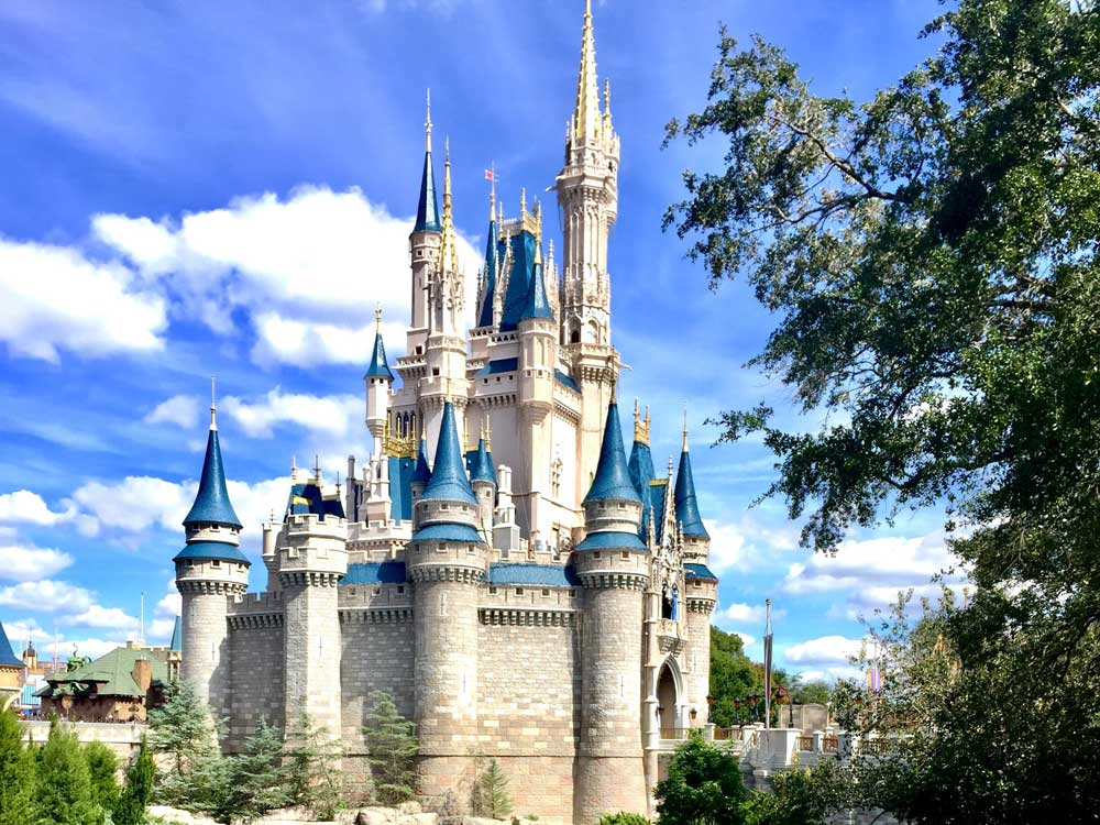
- Two unique towers, very Gothic in detail, announce themselves strongly against the sky. Both are detailed with intricate stone tracery. Gold spires project from behind pinnacles at the tops of the stonework. These gold spires have small architectural ornaments along their ridges called crockets.
- One sits in the center of the western face, and is moderate in its height compared to the other towers.
- Tower #20 is the dominant tower and soars to 189′ in height. It is such a strong architectural element that is shifts the visual balance of the entire Castle. It makes the asymmetrical design of the Castle “feel” right – not discordant, but settled. This tower is so massive that it is supports its own small projecting turret at the top of the tower.
Walt’s Level 4 Detail – Fine details
I’m running out of space, and you’re surely running out of patience. I’ll zoom in on the details of the architecture of Cinderella Castle in a future post… I’ve said that a lot, I know. Guess I have some work to do!
I’d love to hear what you think about the design of Cinderella Castle. Let me know in the comments below!

I love the Castle at Disney. The first time I seen it in person I just stood in awe. We are going back this fall and I can’t wait. Thanks for sharing all this great information!
Whilst I have never been to the Castle I adore the architecture of it & found this article absolutely riveting. All the specific details are included & engineered for a reason… I do wonder at the 13 Gargoyles… I know its significant but cant think why atm.. Thanks you for sharing this its brilliaant
I appreciate the kind words Jeanine! Especially the word “whilst”. We Americans never get to use it. Thanks for reading!